Interactive Museum Exhibit
Animal Crossing: New Horizons Kiosk

Collage of final design
TIMELINE
February 2023 - May 2023
MY ROLL
Solo Project
SOFTWARE USED
PowerPoint
SUMMARY
In this project, I was tasked with creating an interactive museum exhibit based on a common interest of my friends. A game called Animal Crossing: New Horizons was chosen as the common interest and my goal was to curate a museum exhibit with an interactive kiosk. I began by interviewing five friends to learn more about how people feel about this game, what they would want to see in a museum exhibit, and their interest in an interactive kiosk. From this, I was able to better understand my user and plan out what the museum will show and offer its visitors.
My goal was to create a museum exhibit where people can learn more about the current game, its making, and the history of Animal Crossing games. In addition, users would have access to a kiosk where they can create their own personalized villager which they could then save digitally or have it printed. I then created and tested low-fidelity prototypes and used the feedback to create a final, high-fidelity prototype showcasing a well-tested design.
USER PERSONA
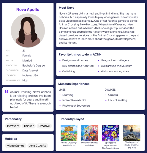
I interviewed five friends about their common interest in the Animal Crossing New Horizons game. This information is used to increase my understanding of what users may want to see in a museum exhibit dedicated to the game. With these interviews, I curated the following persona.
SCENARIO
-
The Indiana State Museum is proposing a plan to create an exhibit on a common interest: the video game called Animal Crossing: New Horizons. Surveying local Indiana residents that played the game has shown great interest in this new exhibit. Animal Crossing: New Horizons was released in March of 2020 at the beginning of the COVID-19 pandemic. With orders to stay home, the game quickly became part of many peoples lifes.
There will be multiple exhibits and interactive elements for visitors. Surveys were conducted and a user persona was created to better understand the wants of visitors to this new exhibit. People have great interest in learning more about the past Animal Crossing games, the current Animal Crossing: New Horizons production and development, and the many characters within the game. In addition, screens for voting on favorite characters and kiosks will be added for visitors to interact with the exhibit. At the kiosks visitors can create their own villager from a set of options to choose from. Visitors can also scan a QR code and use their mobile device to create their villager. The Animal Crossing: New Horizons museum exhibit will also offer a gift shop at the end where visitors can purchase goodies with their favorite ACNH characters, villagers, and items on it. There will be plushes, blankets, shirts, keychains, coloring books, books, an area to pick up prints of the unique villager they created, and more. This exhibit will ultimately help boost the overall number of museum visitors as well as bring in profits from the gift shop.
Visitors, like Nova Apollo, are very excited to visit an exhibit based on their favorite game. Nova is a 27 year old woman who loves playing video games. Like many people, Nova started playing Animal Crossing: New Horizons when it first came out during the start of the pandemic in March of 2020 and has enjoyed the game ever since. Nova wants to learn all about the history of the Animal Crossing games on past consoles and devices. To do this, the museum exhibit will have areas of information and images about the previous games and the devices they were played on. Nova played previous versions of Animal Crossing so she is excited to remember those games and the old devices she played it on.
Nova is especially interested in the creation of her favorite game, the current version, Animal Crossing: New Horizons. The exhibit will walk visitors like Nova through the process of the games production. Following a rough timeline, users can see the game from conception to release. The process and people behind the designing of the game and the technical mechanics behind it. Nova is really interested in learning about this process. Diving into the gameplay, animations will be used throughout the exhibit to show off clips from real users islands, gameplay, and fun interactions within the game.
The exhibit will also dive into the different official characters and villagers within the game. Visitors can learn about their background, personalities, likes, and dislikes. There will also be an interactive screen under each character and villager for visitors to vote for their favorite. The screens will show how many votes the character/villager has for that day so far. These screens will be minimalistic as they are just for visitors to click on a button to add one vote. Simplicity is important here as crowds can potentially form otherwise. Clear instructions and one button to cast a vote is all that is needed. In addition, a larger primary screen above this section will show the top 5 favorite characters and top 5 favorite villagers of the day. Learning more and getting to see which characters and villagers are people favorites are a great way to feel involved in the exhibit.
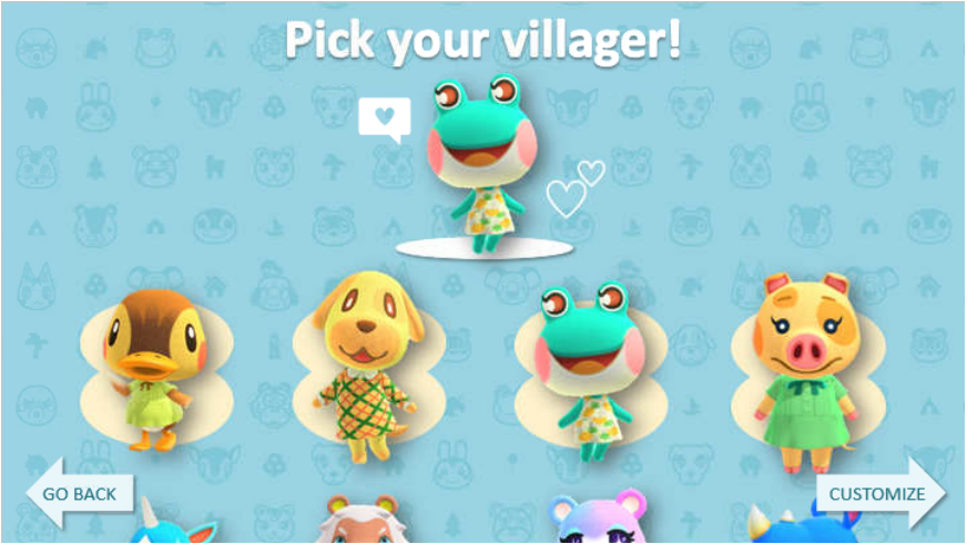
The primary interactive element of this exhibit will be a kiosk and sitting area where users can create their own villager. Nova is extremely excited to do this as the villagers are one of her favotire parts about Animal Crossing: New Horizons. In order to avoid crowding and lines as much as possible, users can quickly scan a QR code and build their villager on their smart phone instead (or any device that has internet access). It is important to Nova that there is not much crowding and plenty of areas to sit. At this kiosk, or within the sitting area using her mobile device, Nova will be walked through a brief process of making her own villager. Nova will first be able to choose what animal their villager will be from a selection menu. Next, Nova can select facial features like eyes, freckles, nose, and mouth options. Then, she can select a unique color scheme for their villager and any clothes they want to add. Lastly, Nova can pick a background for their villager to be on and type in the villagers name. Nova and other users of this interactive part of the exhibit have the option to print an image of their unique villager and download a digital copy. If users want a special printed image of their villager, they can send it to the gift shop to pick up at the front desk and pay a $2 fee. Otherwise they can download a free copy to their device.
This interactive element of designing your unique villager will be quite simple and streamlined. Users will have options, but not too many as the entire process should only take a few minutes to complete. This is important because crowds should be minimized as much as possible and people of all ages will be using this. Thus it is important for the design to be simple and follow a step by step outline. The steps should be shown on the top of the screen and users can see what step they are on and what they have left. Users will be shown their villager as they are taken through the process. At the end, instructions should make it clear that the unique villager can be saved digitally for free or printed at the gift shop for $2. Nova, like other visitors, would print their villager to save the memory of the trip to the museum exhibit and as a homage to her favorite game. While at the gift shop to pick up a print of her villager, Nova would also pick up a plush or two of her favorite characters or villagers and maybe another item. Being able to remember this trip and have souvenirs for her favorite game are important.
WIREFRAME


USABILITY TEST
To learn more about user’s experience in browsing movies, I conducted interviews with three participants. My goal is to gather data related to the tasks that users currently complete to achieve their goals and what problems they have with the process.
-
INTRODUCTION
Hello, my name is Cassidy! Thank you for coming today. We will be looking at a website where people can make their own Animal Crossing villager.
I will be reading from my notes to make sure I remember everything I need to say so I can be consistent with each participant. The purpose of this test is to identify any strengths and weaknesses in the design of this site. Therefore we are testing the site, not you, so you cannot do anything wrong. What you do in this study will be kept completely anonymous. I will not be recording this session, but you will see me take notes so I can remember things better.
PRE-TEST QUESTIONS
Before we begin the test, I would like to ask you a few questions.
How often do you play video games? (Never-Sometimes-Often-All the time)
User 1 - Everyday!
User 2 - Never.
User 3 - Often, if not almost every day.
Have you ever customized your own character in a game? [If yes] Can you give me an example?
User 1 - Yes. Pretty much every game I play like Hogwarts Legacy, Pokemon, Elder Scrolls, World of Warcraft, and lots of others.
User 2 - No.
User 3 - Yes. Well I did it in Animal Crossing. I’ve also done it in games like Pokemon, Dreamlight Valley, and other games.
Do you enjoy character customization? Or find it fun if you haven’t.
User 1 - Yeah, it’s nice.
User 2 - No.
User 3 - Yes I absolutely love it. I spend so much time customizing my characters.
What do you like to see in character customization?
User 1 - A large selection of options.
User 2 - Hair color customization options.
User 3 - I love lots of options!
Have you played any Animal Crossing games before? If so, which version?
User 1 - Yes, New Horizons.
User 2 - No.
User 3 - Yes, I played Animal Crossing New Horizons.
[If you have customized characters before] How did you feel about the character customization process?
User 1 - There's not a ton of customization options. Like I wish you could choose to be an animal or a person. The animals are so cute in the game!
User 2 - Has never done it.
User 3 - It was fast and easy! I kind of wish there were more options though but you get more as you play the game.
Thank you for answering my questions!
INSTRUCTIONS/ PROCEDURE
Now we can begin the test on the site. The entire session should only take about 15 minutes. Essentially I will be asking questions about what you think different things on the screen will do and ask you to complete tasks on the site. This prototype is in its early stages so you cannot click on anything yet. I will ask you what you would do and I will show you the screen that would appear next.
During this test I may not be able to help you with problems you face as that is precisely what we are here to discover! We want to see how the user thinks and handles problems on their own. After the test, I will happily answer as many questions as I can. Remember, today we are testing the site and its functions, not yours, so no worries!
As you work on the task it is helpful for us if you think aloud about what you are thinking and doing. Share any thoughts or reactions that come to mind as you work. If you forget to think aloud, I may remind you to start speaking again. I will also be checking in and asking you questions about the task you are working on or what you expect to happen next, as well.
Do you have any questions?
Great! Let's begin.
BEGIN TEST
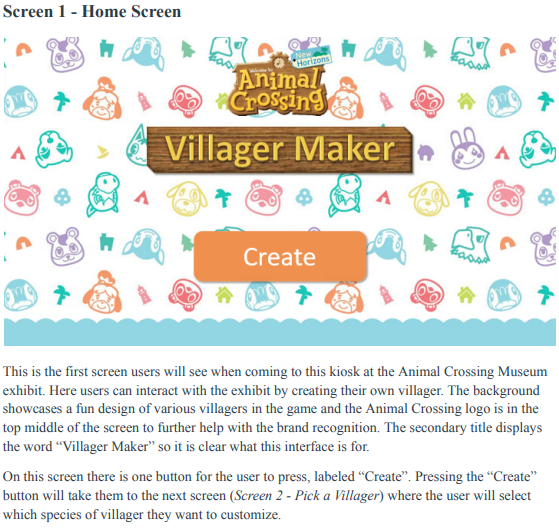
Screen 1 - Home Page:
Let’s say you are at your local museum going through an Animal Crossing exhibit and you come to a kiosk with this screen.
Can you tell me what you see? What do you think you do here?
User 1 - It seems like the start screen on the kiosk to make a villager.
User 2 - I would be creating my own village in animal crossing.
User 3 - I see the start screen of the kiosk to make my own villager.
What would you do on this screen? [click “create” button]
User 1 - Click “create” button.
User 2 - Click the “create” button.
User 3 - I would click the big “create” button.
Do you have any expectations on what will happen when you press the “create” button?
User 1 - I’ll move onto the next screen and start customizing a villager.
User 2 - No because I’ve never played animal crossing so I don’t know what to expect.
User 3 - I will get to start customizing a villager.
Okay, when you press the “create” button it takes you to the following screen.
___________
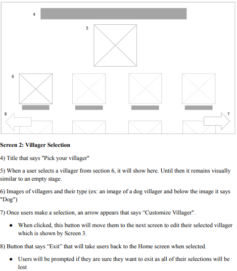
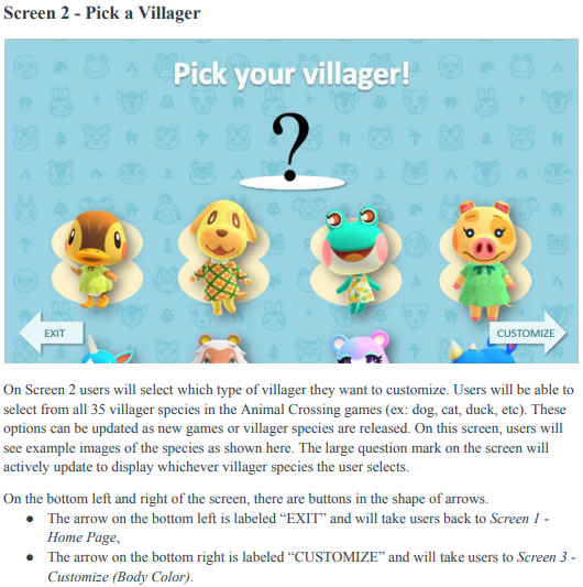
Screen 2 - Villager Selection:
What do you think this page is for? What can you do? [browse and select which villager species you want to customize]
User 1 - It seems like I can scroll through different villager options and select one to start the customization process.
User 2 - It looks like I get to pick the different people in the village. I can click a person and customize them. Like maybe put different outfits. I think I could pick a villager and be done or pick one and then customize.
User 3 - I can scroll through different animal villagers and pick one I want to customize.
What do you expect to happen after you pick a villager?
User 1 - It will show up where the question mark is on the page.
User 2 - I think it will get bigger when I hover over it. And then when I click on it, it would be the only thing on the screen.
User 3 - I think it will show up where the question mark is.
When you select a villager, it will display where the question mark is on the page.
What would you do after you select a villager? [select arrow that says “Customize” to go to the next page]
User 1 - I would select the “customize” button.
User 2 - I click “customize”.
User 3 - I’d click the “customize” button.
When you select the “customize” button it takes you to this next screen.
___________
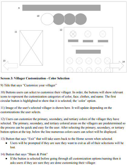
Screen 3 - Villager Customization (Body Color Selection):
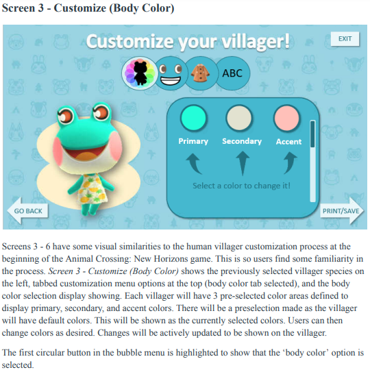
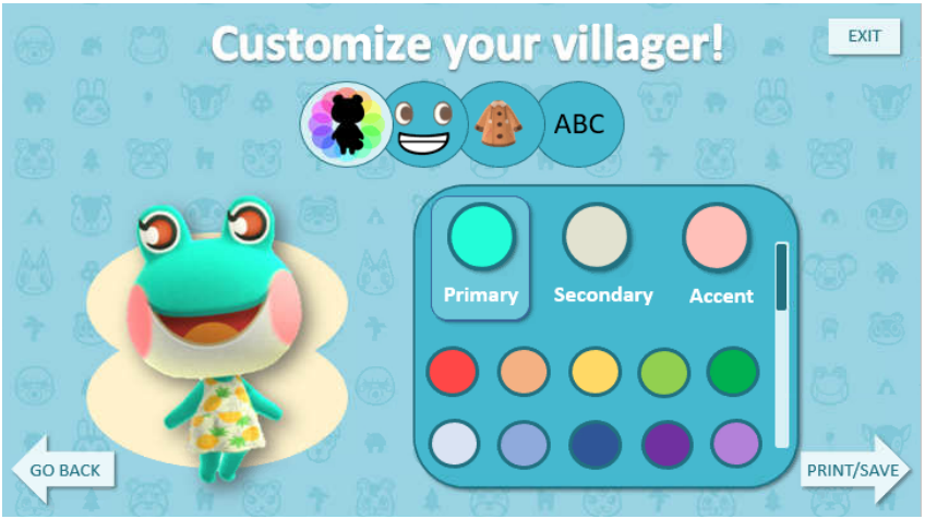
Can you walk me through what you see on this page? What do you think each part of the screen does? [customize villager through color selections for body & go through other customization options at the top of the screen]
User 1 - Well first I see the body and colors so I assume here I can adjust the colors of my villager. There are three colors here so I think I can pick three colors to make up my villager. I also see these other buttons which looks like more ways to customize the villager. The button with the eyes and mouth probably means I can customize the head and face options. The clothes button, I expect to to dress the villager. And the button with “ABC” means I can probably name it.
User 2 - I think the first button with the black animal means you can pick different color frogs you want. So I’d probably pick purple to see what it looks like. The second is the smile so I think you can pick different smiles. The coat seems like you can pick different clothes. ABC is where I think you can name the villager. If I didn’t like the colors I’d go back and pick a different villager. If I liked it I’d go to print and save.
User 3 - Well I see the villager I selected on the left. I also see a bunch of tabs for customization options for body colors, face, clothes, and name I think. The body colors is selected immediately so I see I can select from lots of colors.
What do you think will happen when you click on these colors? [adjust colors on villager showing on the left]
User 1 - I think it would show up in the blank circle and the villager on the left would update to show the color I picked.
User 2 - I think it would change the green frog to whatever color I picked.
User 3 - It would update the colors on my villager showing on the left.
What do you think these three white circles mean?
User 1 - Primary, secondary, and tertiary colors that correspond to the villager
User 2 - I don’t know what they mean. Maybe it whites out the frog?
User 3 - Well normally they mean primary, secondary, and tertiary. Primary is the main color, secondary is the secondary color, and tertiary is the accent colors.
So what would you do on this screen?
User 1 - I'd select a circle and then pick a color. It is just like other character customizations I’ve done. It seems like it is the same to how other games do it.
User 2 - I’d click around on different things to see what they do.
User 3 - So I’d click on primary, secondary, or tertiary and then select the color I want.
On a scale of 1-5 (1 being not confident and 5 being very confident), how confident are you that you know what to do at this point?
User 1 - 5 because it seems like it is the same as other games.
User 2 - about a 3. Kind of winging it but I think I can figure it out.
User 3 - 5, it's just like the other character customization options in games.
After you select your desired colors, what would you do next? [click the next menu customization option - the face]
User 1 - Once I picked my colors I would click on the face
User 2 - I would click “print and save”.
I informed the user that a screen pops up and asks if they are sure they are finished because there are more customization options and their villager does not have a name yet. There are buttons that say “keep customizing” and “print/save”.
User 3 - I’d go to the next customization tab, the face.
When you click on the face tab, this screen comes up.
___________
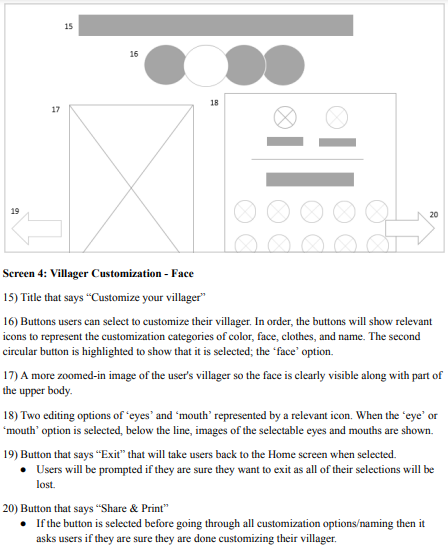
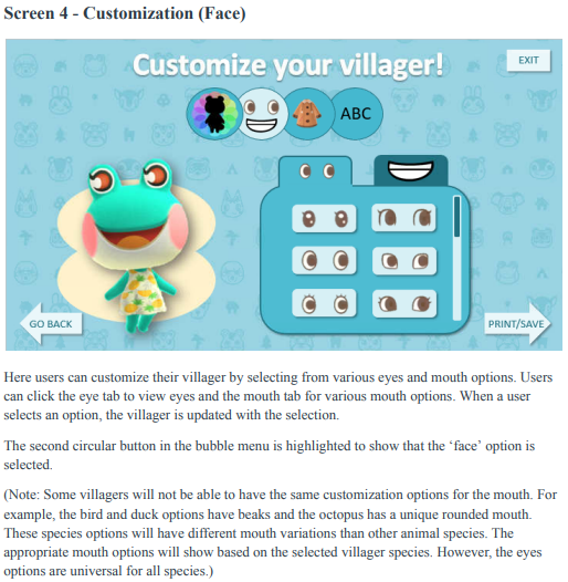
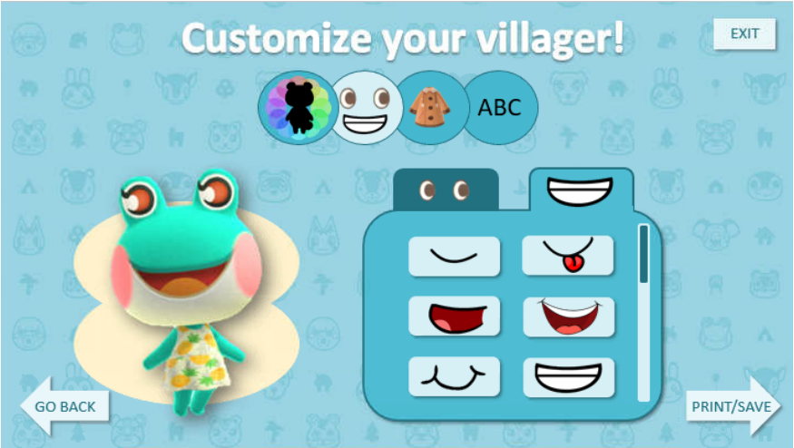
Screen 4 - Villager Customization (Face):
Please tell me what you think each part of this page means and what it does. [customize villager eyes and mouth]
User 1 - I see two tabs, one with eyes and the other has a mouth. I see a scroll bar. So I can scroll through the eyes and select from different options. I assume the mouth tab will probably be the same way as this eye tab. I expect that when I click on an option it will show on the villager to the left.
User 2 - The eyes change the different eyes on the frog. Then the tab for the mouth lets you choose different mouths.
User 3 - Here it looks like I can customize the eyes and mouth on the villager. Seems like there are lots of options for me to scroll through which I like.
Does this make sense to you?
User 1 - Yes, it's just like other games.
User 2 - Yes.
User 3 - Yes!
Once you have made your selections, what would you do next?
User 1 - Next I would click on the clothes tab.
User 2 - I would go to the button with the coat on it.
User 3 - I’d go to the tab with the clothes on it.
When you click on the tab with the clothing on it, you will see this screen.
___________
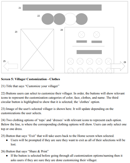
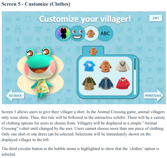
Screen 5 - Villager Customization (Clothes):
What do you think each part of this page does? [choose tops and dresses for villager]
User 1 - I expect to click on clothes and have it show up on the villager. I see the scroll bar so It seems like I can go through lots of options.
User 2 - Pick what clothing attire you want your villager to wear.
User 3 - Lets you browse clothing options for the villager.
Once you have made your selections, what would you do next?
User 1 - Click on the “ABC” button.
User 2 - Click the “ABC” button.
User 3 - I’d name my villager by clicking the “ABC” button.
When you click on the “ABC” tab, this screen comes up.
___________
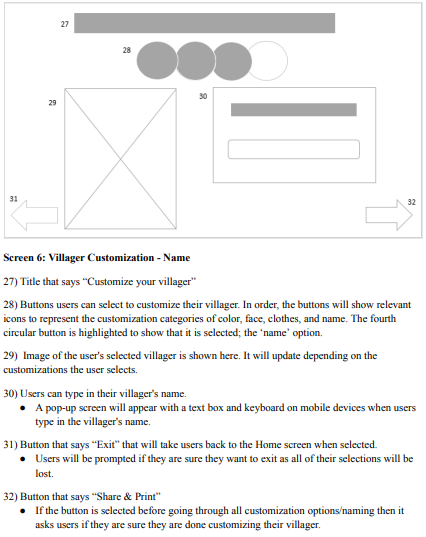
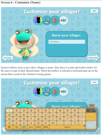
Screen 6 - Villager Customization (Name):
Please tell me what you think each part of this page means and what it does.
User 1 - It looks like I can name my villager. I think I click on the text box and a keyboard would pop up. Unless the kiosk already has a keyboard, then I’d just use that to type in a name.
User 2 - I would give my villager a name.
User 3 - I can name my villager here so I’d click on the text box and type in their name.
How would you type in their name?
User 1 - I’d click the textbox and start typing.
User 2 - I would hover over “start typing” and click on it. And start typing.
User 3 - I would click “start typing” and type in their name. I expect a keyboard to pop up for me to type on.
When you click on this text box a keyboard pops up. What would you do next?
User 1 - I would use the keyboard and type in the name I want.
User 2 - Type in the name.
User 3 - Type in my villagers name.
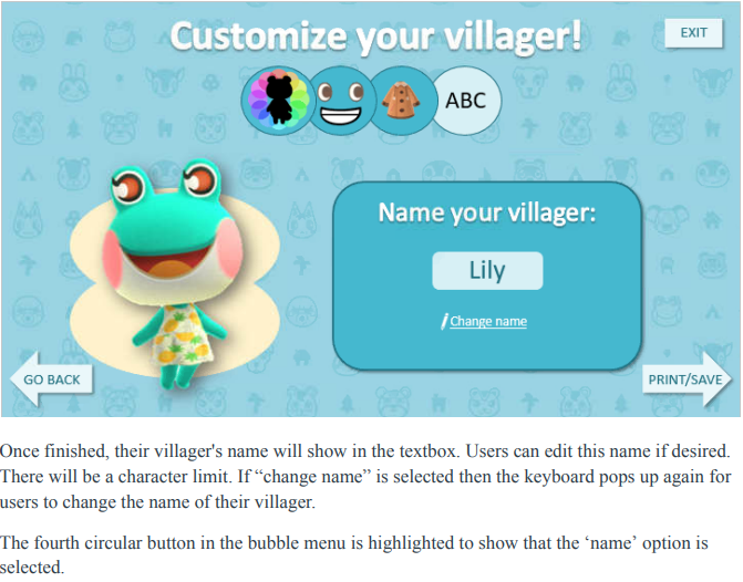
After you type a name in this screen comes up. Can you tell me what you see?
User 1 - The name I typed in comes up where the textbox was. It says change name below the name i typed in so I assume clicking that would let me adjust the text.
User 2 - The name I typed in shows and it says change name so I can change it if I want.
User 3 - I see that my villagers name comes up and that I can click “change name” if I want to type in a different one.
What will you do once you are finished naming your villager? [click “print/save” button]
User 1 - When I’m done I’d click the “print and save” button.
User 2 - Click “print/save”.
User 3 - Click the “print/save” button.
When you click the “print/save” button, the following screen comes up.
___________
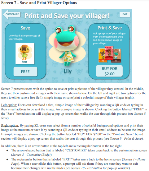
Screen 7 - Save and Print Villager:
Can you walk me through what you see on this page? [decide whether you want to “save” or “print and save” a picture of the villager you created]
User 1 - I see two options, “save” and “print and save”. “Save” says you can download a simple image of your villager. I would expect to see a QR code to download the picture. The image will probably be like what it shows here [in the box]. “Print and save” says I can print a picture of my villager and save it. I assume you can save it like the other option let you. But the “Print and save” seems to have more cute options. I like the cards you can choose from. It seems like you can pick from different colors for it. I also see an exit button at the top of the screen so I can just leave and do neither if I want.
User 2 - it seems like you can download it or you can print a picture from the gift shop. I think the save would send it to your email. Then the print lets you buy it for 2 dollars.
User 3 - It looks like you can save or save and print your villager you made. Save is free and gives you a simple picture to download. I assume its either a QR code or like you put in your email or phone number. Then Save and print is $2.99 and it looks like you have a cooler image and more customization options.
What do you think will happen when select the “Free” button under the “Save” section? [(device dependent) scan a QR code (KIOSK) or send it to an email address to download it for free (KIOSK AND PHONE)]
User 1 - “Save” says you can download a simple image of your villager. I would expect to see a QR code to download the picture. The image will probably be like what it shows here [in the box].
User 2 - I think I’ll have to put in my email and it will send me the picture.
User 3 - It will probably show me a QR code to scan for my picture or have me put in my phone number or email.
What do you think will happen when select the “buy for $2.99” button under the “Print and Save” section? [print and save a picture of their villager with colorful backgrounds at the museum gift shop for $2]
User 1 - “Print and save” says I can print a picture of my villager and save it. I assume you can save it like the other option let you. But the “Print and save” seems to have more cute options. I like the cards you can choose from. It seems like you can pick from different colors for it.
User 2 - It will print it out and I will pick it up at the gift shop and I’ll have to give them two dollars. I think it will also ask for my email so I have a picture of it.
User 3 - I think I’ll be able to customize what exactly I want and I’ll probably put some kind of contact information in like an email. I might have to pay for it then or maybe I’ll pay for it at the gift shop.
Which option would you choose? Why?
User 1 - I’d click print and save because the card print is cool and interesting. Seems to be more customization options than the free one.
User 2 - Buy it for $2 so it’s on w nice card and already printed.
User 3 - Probably print and save because it is so much cuter and it is an item I can take with me.
What do you think the images in each section mean?
User 1 - They are examples of what you will get with each option.
User 2 - Middle is what I created and what I’ll get . The image under save is the example of what it will look like. The image on the right is what it will look like for print/save.
User 3 - They are examples of each option you can choose. The free one is simple and the $2.00 is prettier with more color options.
How would you rate this process on understandability (1 is poor and 5 is great). Why?
User 1 - 5, it makes sense to me. It is just like how other games let you customize characters.
User 2 - 5.
User 3 - 5 because it is just like other games. Plus the layout matches the Animal Crossing game in a few ways so it is familiar.
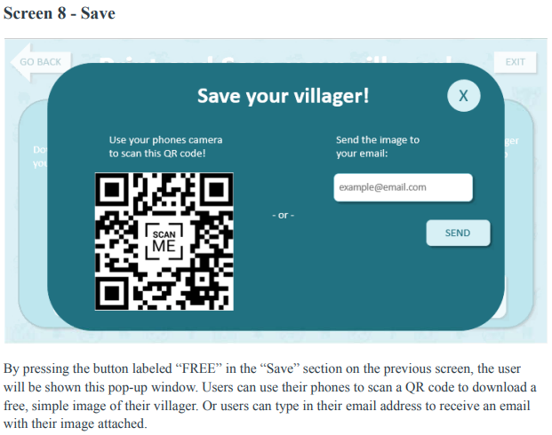
Lets walk through each option together. First, go ahead and click the “free” button in the Save section.
When you click that button you will see this screen.
___________
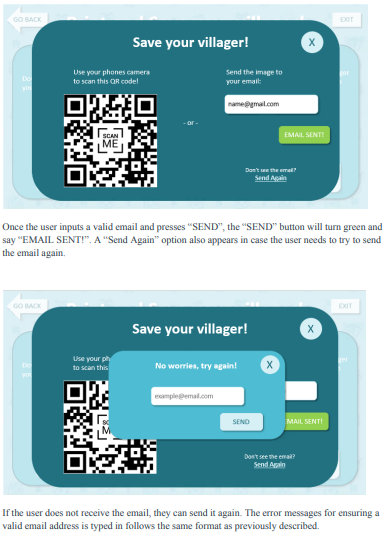
Screen 8 - Save Image of Villager:
Can you tell me what you see and what you think each thing does?
User 1 - I can scan the QR code or put in my email to download the picture.
User 2 - It looks like I can email myself the picture. I also see this that says I can scan a QR code. I learned about those recently. I’d probably just put my email in though.
User 3 - I see that I can scan a QR code or email myself the image of the villager I made.
Which option would you most likely try? Why?
User 1 - QR code because it is easy and I don’t have to put in my email.
User 2 - Email so I always have it.
User 3 - Honestly, I’d probably do both so I have an email I can always find and just save it to my pictures quickly.
What do you expect to happen if you scan the QR code?
User 1 - I would be able to save the image.
User 2 - The picture would come up on my phone for me to save it.
User 3 - I’d save the picture of my villager to my phone.
What do you expect to happen if you put in your email?
User 1 - I’d get an email with the image in it for me to download.
User 2 - I would get an email so I can save the picture to my phone.
User 3 - I’d get an email saying thank you for coming and it would have the image of my villager for me to download.
Okay now we will walk through the second option, to print and save the villager for $2.00.
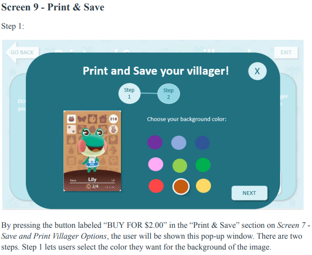
When you click the button that says “buy for $2.00”, this screen will come up.
___________
Screen 9 - Print and Save Image of Villager (Step 1):
Can you tell me what you see and what you think each thing does?
User 1 - It looks like I can pick from different background colors. It says step 1 and step 2 so I assume I’ll pick the color here and finish up the process in the next step.
User 2 - I will pick a color I like for the background and go next.
User 3 - I can change the color of the background and then go onto the next step.
What do you expect to see on the next step of this process?
User 1 - Maybe pay? Or just confirm my order and send it to the gift shop.
User 2 - Put in some information or maybe pay.
User 3 - I might have to pay or put in some contact information to show to the gift shop to get my image.
When you go to the next step, you will see this screen.
___________
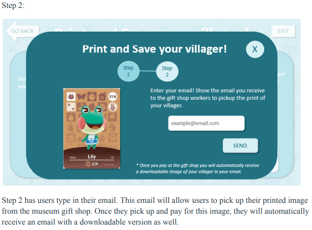
Screen 9 - Print and Save Image of Villager (Step 2):
Can you tell me what you see and what you think each thing does?
User 1 - I see what my image will look like and it says that I need to put my email in. And to show the email to the gift shop to get my image. It also says at the bottom that once I pay for the image I’ll get the downloadable copy automatically.
User 2 - I see the villager I made on the background I chose. And that I need to put my email in and show it to the gift shop to get my picture.
User 3 - I see my villager on the background I customized. I also see the instructions to put in my email and then show the email I receive to the gift shop to get my picture. Also that I will get an email with my image once I pay for it at the gift shop.
Does this process make sense? Would you change anything about it?
User 1 - Yes and no I wouldn't change anything.
User 2 - It makes sense and is simple. I think it is good.
User 3 - It makes sense and I don’t think I would change anything.
FOLLOW UP QUESTIONS/ CONCLUSION
What did you think of this character customization experience?
User 1 - It was good. Easy.
User 2 - I liked it. But I didn’t know what the three white circles were. But I tend to click on stuff so I think I would have figured it out. I think I could of figured everything out. I’ve never made a character before so for people whose done it it probably makes sense.
User 3 - 5, it was fun!
Is there anything you liked about this process?
User 1 - Everything was good.
User 2 - I liked how much you could customize like the color, eyes, and mouth. I thought maybe you couldn’t. Change much.
User 3 - It looked nice and was really easy. I think there was just the right amount of customization options too. Not too many to where you’re working on it for hours, but not too few to where it doesn't actually feel custom at all.
Is there anything you did not like about this process or that you found confusing?
User 1 - No, it was just like other games.
User 2 - No it was pretty good.
User 3 - No.
Do you have any suggestions of improvement?
User 1 - No.
User 2 - The three white buttons. But I don’t know how to improve that. Maybe say cheek, main color, and chin or something?
User 3 - Nope.
Overall, how would you rate your experience using this application? (1 is poor and 5 is great). Why?
User 1 - 5 because everything was easy to understand. It also looked nice.
User 2 - 4.5 because the colors are nice. It looks nice and entertaining. And I can print it out and take home my own card.
User 3 - 5 it was quick and easy!
[If they have customized characters in the past] How does this compare to other character customizations you have used before?
User 1 - It was good and similar in structure to other character customizations. Very intuitive.
User 2 - Has not customized before.
User 3 - It looked and flowed just like other games character customizations.
Thank you for your time today!
IMPROVEMENTS FROM USABILITY TEST
The first improvement I made was with shortening button names, titles, and instructions. This helped just get rid of excess words. I also adjusted the clothing screen from showing two tabs for shirts and dresses to just one tab where shirts and dresses are shown together. I did this because shirts and dresses appear the same on villagers in Animal Crossing and it’s one less tab for users to look through.
This usability test did show a couple of issues with this iteration of the design. First, it may be good to give users more information about what exactly they are doing at the kiosk. For those who may know nothing about Animal Crossing and what a “villager” is, they may be completely lost. My second user was a good representation of this person. This can be resolved within the design itself by giving more explanation or in the areas of the kiosk/exhibit to say what exactly people can do there.
Secondly, the customization of a villager's body colors was the primary source of confusion. The second user really struggled here as they had never customized a character before and weren’t sure how to use this screen. This showed me that I need to adjust how this customization option is represented because people with little to no character customization experience, may not know how this works. Some ideas for improvements I have is to write primary, secondary, and tertiary (or use other identifying words e.g.: main color, secondary color, accent color, etc.) under the three blank circles. With this, I will also only show the colors after the user clicks on one of the main circles to edit which will help minimize confusion. Lastly, I will not leave the main circles blank. They will show the colors currently selected to give the villager their default colors.
FINAL DESIGN
IMPROVEMENTS FROM WIREFRAME TO FINAL UI
From the initial wireframe to the final UI, there were many improvements. Walking through the iterations and the testing helped highlight different areas that could be improved. Some issues I was able to notice on my own but others were discovered when watching users work through the design. Some improvements I made by working through iterations were shortening button names, titles, and instructions. Originally these were longer as I was trying to be clear and descriptive, but as I was iterating I realized it could be shorter. Getting rid of excess words while keeping clarity improved the look of the design and experience of the users. For example, originally Screen - 7 Save and Print Villager Options were much wordier in earlier iterations of the design. I worked to cut down on the fluff and put the cost of each option on the buttons instead of in the description.
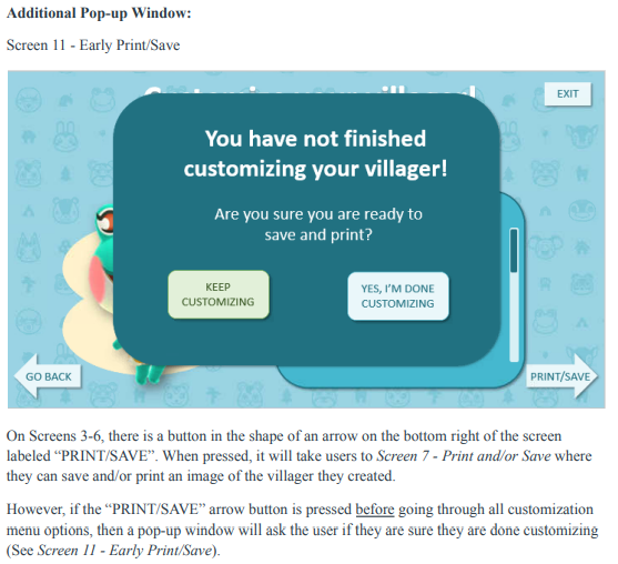
The villager customization screens (Screens 3-6) were also adjusted through my iterations. I decided to take the clothing options from offering two sections for shirts and dresses down to just one section (See Screen 5 - Customization (Clothes)). This is because I remembered that in Animal Crossing games the villager's shirts and dresses are the same length so I wanted to stay true to the game. This also helped cut down on another click users would have to make in this process despite no visual length difference between the two types of clothing. I also decided to adjust the way I was visually showing multiple options in a particular section. An example of this is within face customization where users can choose to customize their villager's eyes and mouth. Originally I had it all within one section but eventually redesigned this to instead mimic a tabbed folder to view all eye or all mouth options.
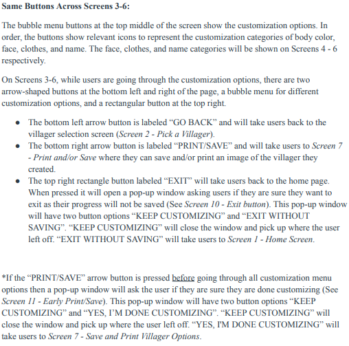
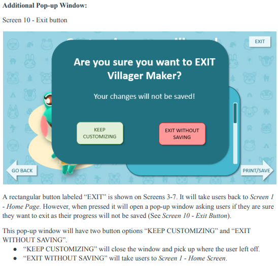
After testing, I made more improvements to the customization process. Specifically, the body color customization section (See Screen 3 - Customization (Body)) was adjusted because it became clear that it was confusing for users, especially those with little experience customizing characters in video games. To resolve confusion, I added some clearer visual cues, labeled the color sections (as primary, secondary, and accent), and added instructions when first viewing this screen. Now, the final UI shows preselected colors that the villager is shown with by default with brief, clear instructions to help new users understand how to use this feature. I also added an exit button in the customization section (Screens 3-6) as I noticed it was missing during testing. I wanted to make sure users can easily and quickly exit to the home screen during any stage of the villager-maker process.
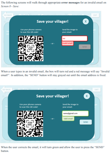
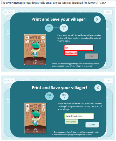
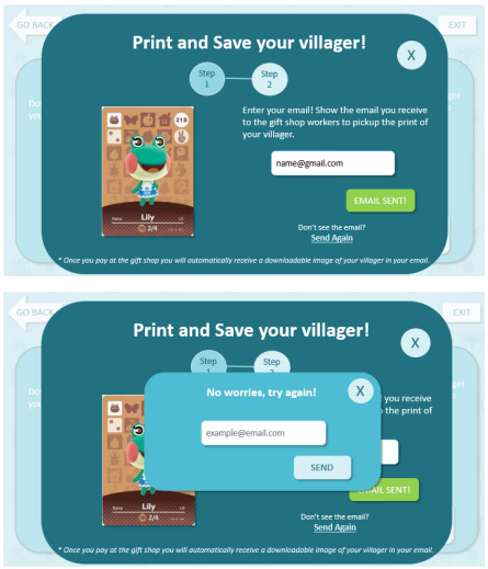
Lastly, I ensured there were appropriate error messages with prompts to help the user fix/understand errors. This was especially useful in the “Save” and “Print & Save” sections as they require users to type in their email address to receive an email with a downloadable image of their villager. If a user types in an invalid email address, the text box is highlighted red and a tab pops ups that says “Invalid email!”. The “SEND” button is then also grayed out so it cannot be pressed. Once the user fixes the email and it is valid, it will change from red to green and the tab will update to say “valid email!”. The user can then press the “SEND” button as it is no longer grayed out. When the user inputs a valid email and hits “SEND” then the button will turn green and say “SENT!”. There is also a way for users to resend the email if they do not see it or do not receive the email.
LESSONS LEARNED
This project reminded me of the importance of testing a variety of users to ensure effective design. By testing users with different experience levels of video games and character creation, I was able to find painpoints and improve the design of my kiosk. This carries over into other projects as you want to make sure designs are usable and accessible for a variety of users.