Movie Finder

Collage of final design
TIMELINE
December 2022
MY ROLL
Solo Project
SOFTWARE USED
Figma
InVision
SUMMARY
In this project, I wanted to create a better experience for searching, filtering, and browsing movies. I started by interviewing users to learn how people do this, what sites they visit, and how they feel about the overall experience. This showed me that people typically visit multiple sites for different purposes. My goal was to create a website that allowed users to view all relevant movie information in one place. I conducted a task analysis and created an activity diagram to learn more about this issue and find ways to improve it. From there, I created and tested low-fidelity prototypes and used the feedback to create a final, high-fidelity prototype showcasing an improved idea for this issue.
PROBLEM
It is difficult to browse movies that are playing and coming soon on movie theater sites.
There are no or limited filtering options on movie theater sites.
Users have to visit multiple websites to see all the desired information about a movie like rating, trailer, description, reliable reviews, and more.
The movie browsing experience lacks customization.
SOLUTION
Improve the browsing experience by adding filters and ensuring relevant information is clearly displayed.
Users can filter movies by rating, genre, location, day, and time.
Add movie information (title, rating, genre, duration, description), relevent user reviews (Rotten Tomato, MetaCritic, Google Reviews) that link to the movie reviews on the selected site, and allow users to buy tickets on one page.
Users can make an account to save theater locations for faster searches and save movies they are interested in.
USER PERSONAS
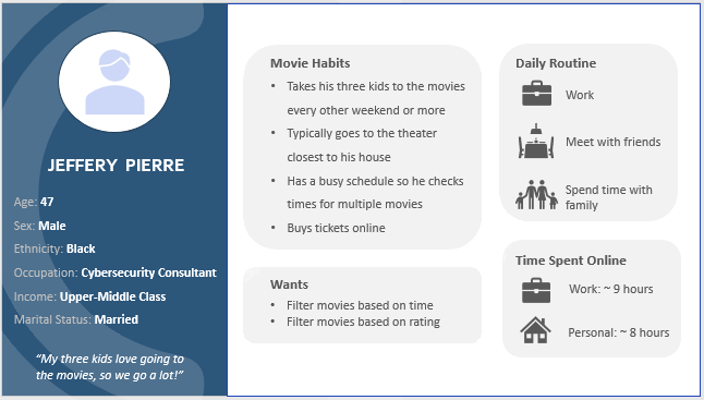
Participant 1 - Jeffery Pierre
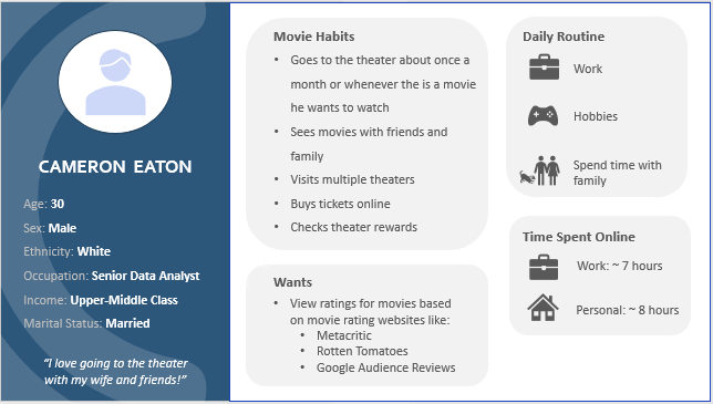
Participant 2 - Cameron Eaton

Participant 3 - Katlyn Goodridge
USER RESEARCH QUESTIONS
To learn more about user’s experience in browsing movies, I conducted interviews with three participants. My goal is to gather data related to the tasks that users currently complete to achieve their goals and what problems they have with the process.
-
Participant 1 - Jeffery Pierre: “Every other weekend/twice a month and sometimes more.”
Participant 2 - Cameron Eaton: “About once a month depending on what movies are out.”
Participant 3 - Katlyn Goodridge: “About once every two months to see a movie.”
-
Participant 1 - Jeffery Pierre: “Same theater, the one closest to my house.”
Participant 2 - Cameron Eaton: “The same few theaters because they are the closest and offer similar quality amenities.”
Participant 3 - Katlyn Goodridge: “Typically I go between two movie theaters. One is a big box theater with nice seats and is close to home. The other one is a small local business that does unusual or art house films.”
-
Participant 1 - Jeffery Pierre: “Yes.”
Participant 2 - Cameron Eaton: “No, I just use the website to buy tickets.”
Why? “Google is easier to find information about the movies on.”
Participant 3 - Katlyn Goodridge: “Yes, I have looked into movies on the website in order to figure out what’s currently playing.”
-
Participant 1 - Jeffery Pierre: “I ask the kids what they want to watch.”
Participant 2 - Cameron Eaton: “Either if I hear about it/see a trailer that interests me or if I notice a movie I haven't heard about yet has good ratings.”
Participant 3 - Katlyn Goodridge: “Based on friend recommendations, stuff on the internet (fandom buzz on tumblr), typically word of mouth.”
-
Participant 1 - Jeffery Pierre: “I’ll use Google to search and look at different websites.”
Participant 2 - Cameron Eaton: “I’ll look around on Google, go to YouTube, or see what people are saying on Reddit. I feel like you kind of have to go all over the place to find different information.”
Participant 3 - Katlyn Goodridge: “I’ll talk to my friends, check Tumblr, or just Google about it. I guess it depends on what I’m specifically trying to learn about because different sites have different movie information.”
-
Participant 1 - Jeffery Pierre: “Mostly teen, popular movies, PG13, action”
Participant 2 - Cameron Eaton: “Any, I watch all kinds of movies.”
Participant 3 - Katlyn Goodridge: “I typically see blockbuster-type movies with friends. I also like to see more “artsy”/original films.”
-
Participant 1 - Jeffery Pierre: “My children.”
Participant 2 - Cameron Eaton: “Friends and family.”
Participant 3 - Katlyn Goodridge: “I go to movies with my friends or dad.”
-
Participant 1 - Jeffery Pierre: “I search for certain movies and times. I don’t think I ever look at what's coming up.”
Participant 2 - Cameron Eaton: “Buy tickets and look at what rewards they [the theater] offer”
Participant 3 - Katlyn Goodridge: “Purchases tickets ahead of time, check showtimes, movie ratings, and summary.”
-
Participant 1 - Jeffery Pierre: “Online 100%. It is so much quicker and easier.”
Participant 2 - Cameron Eaton: “Online! I like the ability to look ahead and view the seat selection in advance. See what is available and select the best seat for me.”
Participant 3 - Katlyn Goodridge: “ I typically purchase tickets ahead of time online in order to pick seats.”
-
Participant 1 - Jeffery Pierre: “Specific time/days (because I am so busy), and rating. Having a way to filter by time/days would let me squeeze movies in a lot easier than now where I have to go through each one, one by one!”
Participant 2 - Cameron Eaton: “See ratings based on movie rating websites. I’d use it to browse new movies I was not previously interested in and then if they have a high rating, I might go see it.”
What movie rating websites do you use? “Metacritic, Rotten Tomatoes, and Google Audience Reviews.”
Participant 3 - Katlyn Goodridge: “I would like to be able to filter searches by genres.”
-
Participant 1 - Jeffery Pierre: “Metacritic and Rotten Tomatoes.”
Participant 2 - Cameron Eaton: “Metacritic, Rotten Tomatoes, and Google Audience Reviews.”
Participant 3 - Katlyn Goodridge: “I just use Google and Rotten Tomatoes usually.”
-
Participant 1 - Jeffery Pierre: “Log on, look at the different movies the kids liked, look at times, order tickets.”
Participant 2 - Cameron Eaton: “Go online, look at the times, check how many seats are available in each theater, select the theater that has the least sold/best seats, and buy my tickets/select seats.”
Participant 3 - Katlyn Goodridge: “Go online, look at movies or search for the one I’m looking for, and order tickets and select seats.”
-
Participant 1 - Jeffery Pierre: “It’s fine and simple.”
Participant 2 - Cameron Eaton: “I really like the seat selection option.”
Participant 3 - Katlyn Goodridge: “The process is pretty streamlined, so I don't really have any complaints.”
-
Participant 1 - Jeffery Pierre: “I want to have a filter for time! I have a very busy schedule and don't want to look through everything one by one. Filtering by ratings would also make finding the movies my kids want to see a lot easier.”
Participant 2 - Cameron Eaton: “I wish they actually showed reliable reviews. Like from the sites I mentioned earlier. I always have to go to so many other sites to get a full picture of what the movie is about, how it is being received, and then to buy tickets. I feel like it could just be better.”
Participant 3 - Katlyn Goodridge: “I’d like it to be easier to browse for movies. I feel like a theater website is just good for buying tickets and there isn’t all the information in one place.”
Key Takeaways:
Users visit multiple sites to view all the information they want like trailers, reviews, movie information, and ticket buying.
Browsing on theater sites is difficult and time-consuming since there are no filtering options.
Users typically just use theater websites to purchase tickets.
USER STORY
"As a busy parent, I want to be able to filter movies, so that I can find movies I want to watch quicker, but currently I have to take extra time to look through each movie one by one since there is no filter."
HIERARCHAL TASK ANALYSIS
Identifying and displaying tasks users have to currently complete to find a movie and buy tickets.

0. Find a PG rated movie with a showtime that starts between 2 and 6pm today.
Pick a theater you would like to go to
Go to the theaters website
2.1 Log in if you have an account
Find the movies currently playing
Select movie you want to see
5.1 Look through movies to find those rated PG
5.2 Of the movies rated PG, find a movie with a showtime between 2 and 6pm
Order tickets
5.1 Select the number of tickets you want to purchase
5.2 Pick your seats (if the theater has this feature)
5.3 Input personal information
5.4 Input payment information
5.5 Confirm order
ACTIVITY DIAGRAM
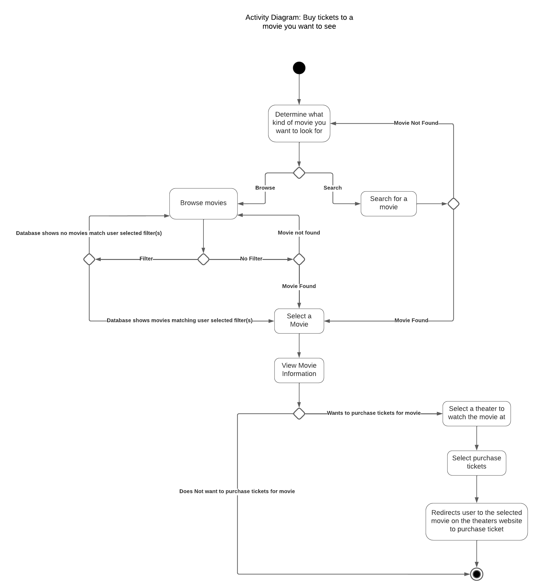
UNDERSTANDING THE THEATER SYSTEM
Use Case Diagram (local theater chain)
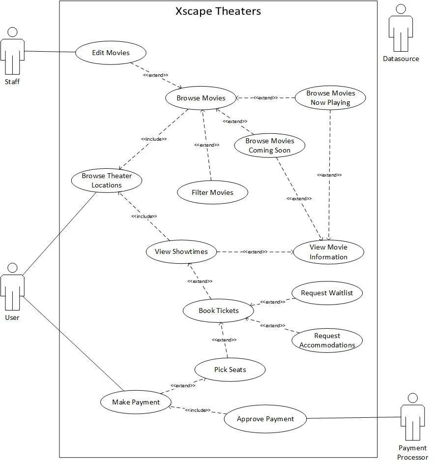
Functional Requirement Specifications:
-
Community Groups
Employees
Managers
Shareholders
-
Users
Database
Payment Processing
Staff
-
Current Implementations
Users can view different cities where Xscape Theaters are located.
Users can select a movie location to view more information such as address, phone number, hours, general information, ticket pricing, and accessibility services.
Users can view movies currently playing and coming soon.
Users can filter movies by genre and rating.
When users select a movie, they will see an image for the movie, movie information (genre, rating, duration), movie description, and showtimes (day/time).
Users can select one, to a max of eight, seat(s) per purchase.
When selecting the number of tickets to purchase, users will see the total cost of the selected tickets.
Users can book their own seats for a selected movie showing of their choice.
While selecting their seats, users can see available, taken, and selected seating.
The booking seat system will not allow users to select more seats than the previously confirmed number of tickets purchased.
Booking seat system will use color awareness so those with color blindness can successfully book tickets.
The system will serve users as first come first serve.
The system will work with the database to keep track of processes.
The database will keep information about theaters, movies, theater rooms, showtimes, users, and taken or available seats.
Future Implementations
For future improvements for this system, adding more options to filter movies would be very useful. In addition to genre and rating, users could also filter movies by showtime and customer reviews. Including a search bar for uses to look up specific movie titles would also be beneficial.
Users could have the ability to input their order number and email and cancel an order online. This can either trigger a refund or a voucher for the paid price for future use.
A useful accessibility feature that can be implemented is the addition of users to use an 24/7 automated phone booking system.
Seats are put on hold for ten minutes while the user finishes purchasing the tickets and payment is accepted.
Users can be placed on a waitlist for tickets if some become available for users whose preferred showtime for a movie is full.
Thus if there are any cancellations, users on the waitlist can be notified by email or text that there is an availability. They have a certain amount of time to accept and purchase the tickets before it moves onto the next person in the waitlist.
Users can also request additional needed accommodations in the theater when booking online and can see the number for an automated booking feature over the phone.
System Sequence Diagram (local theater chain)
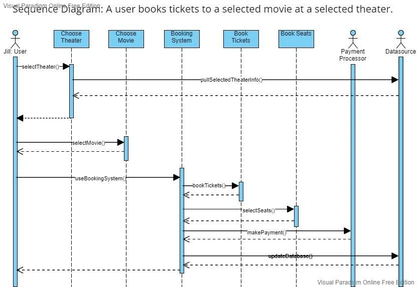
WIREFRAME
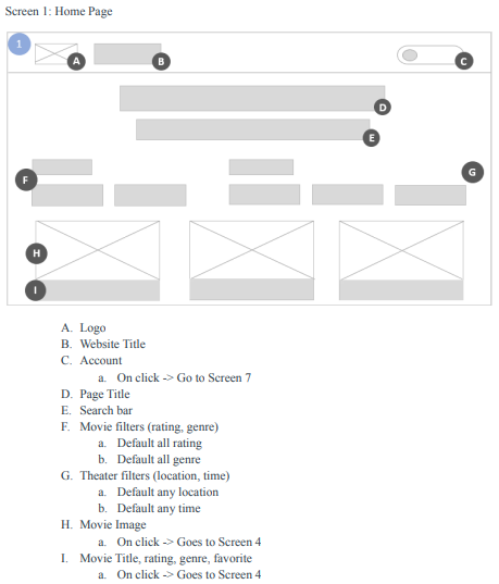
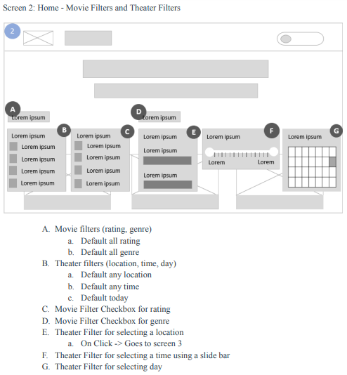
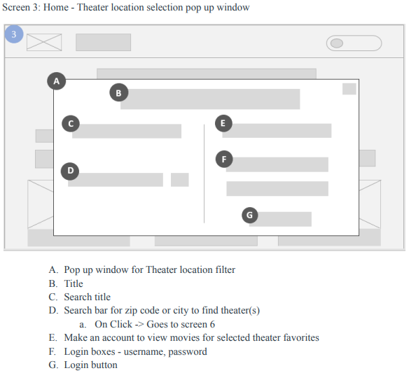
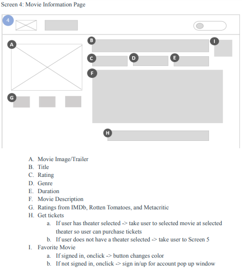


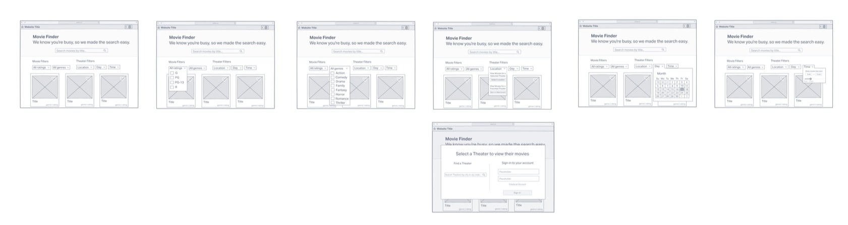
Slightly higher fidelity wireframe of some of the previous screens.
USABILITY TEST SCRIPT
-
Hi, ________. My name is Cassidy, and I’m going to be walking you through this session today.
Before we begin, I have some information for you, and I’m going to read it to make sure that I cover everything.
You probably already have a good idea of why we asked you here, but let me go over it again briefly. We’re asking people to try using a website so we can see whether it works as intended. The session should take about 40 minutes.
The first thing I want to make clear is that we’re testing the website, not you. You can’t do anything wrong here. In fact, this is probably the one place today where you don't have to worry about making mistakes.
As you use the website, I’m going to ask you to try to think out loud as much as possible. Say what you're looking at, what you're trying to do, and what you are thinking. This will be a big help to us.
Also, please don't worry that you're going to hurt our feelings. We're doing this to improve the site, so we need to hear your honest reactions.
If you have any questions as we go along, just ask them. I may not be able to answer them right away, since we are interested in how people do when they don't have someone to help them. But if you still have any questions when we are done I will try to answer them then. And if you need a break at any point, just let me know.
This session will not be recorded, but I will be taking notes throughout the session so I can remember everything easier.
________________________________________
Do you have any questions so far?
Okay. Before we look at the site, I’d like to ask you just a few quick questions.
First, what’s your occupation? What do you do all day?
Now, roughly how many hours a week would you say you spend online - whether it's browsing the internet, using social media apps, or for work?
How many hours a day do you spend online?
How many of those hours would you say is spent on work? How about recreational?
What kind of sites are you looking at when you browse online?
Do you have any favorite websites?
Okay, great. We are done with the questions and we can begin looking at things.
________________________________________
First, I’m going to ask you to look at this page and tell me what you make of it: what strikes you about it, whose site do you think it is, what you can do here, and what it’s for. Just look around and do a little narrative outloud.
You can scroll if you want to, but please don't click on anything yet.
(1 minute)
________________________________________
Thanks. Now I’m going to ask you to try doing some specific tasks. I’m going to reach each one out loud and also give you a printed copy.
Again, we're testing the site, not you. And remember to think out loud as much as possible as you go along.
(Go through scenarios)
________________________________________
SCENARIOS: (ask for expectations on the next screen)
You want to take your young children to see a movie later today around 6pm. Find a movie they would like to see.
You and your friend want to go to the “Xscape Theater” in Jeffersonville, Indiana. Find a movie that you would go with this friend and purchase two tickets.
Save a movie and theater to refer to at a later date.
Remove a movie you saved.
Remove a theater you saved.
Edit your name.
Check the audience reviews for a movie you want to see.
Watch a trailer for a funny movie.
Thank you, that was very helpful.
________________________________________
How would you rate ______ on ease of use? (1 being very difficult and 5 being super easy)
How did this process compare to your current movie browsing and ticket purchasing experience?
What did you like the least about this process?
What did you like the most about this process?
________________________________________
Thank you, that was very helpful.
Do you have any questions for me now that we are done?
Great! That concludes our session for today. Thank you for your time!
USABILITY TEST FINDINGS
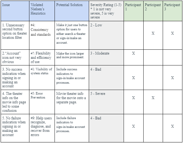
Two of the biggest improvements for the site comes from adjusting the theater location filter and what information is shown on the movie information page.
The location filter originally had two buttons but they essentially did the same thing so I removed one and will adjust the options shown depending on if the user is logged in or not.
Participant 1 and participant 2 each had some mild to moderate confusion about the movie information page. Originally I had the movie information and the theater information the user can or already did select on the same page, but participant 1 thought that when they saved a movie, all the information including the theater selected at that time would be saved. Which is not what happens, it is just the movie. Participant 2 had mild confusion about what it did. I thought of a solution to this problem, to separate the information to two pages, which makes much more sense.
This usability test was very beneficial in improving the design and functionality of the site for users.
FINAL DESIGN
IMPROVEMENTS FROM WIREFRAME TO FINAL DESIGN
Designing the initial low-fidelity wireframe, a slightly more detailed low-fidelity wireframe, and then the final high-fidelity wireframe was an interesting process that led to a number of improvements. Apart from aesthetic changes, one change I made to the layout of the Home Page was where the movie information sat. Initially I wanted to have it on the bottom. However when a user first comes to the homepage, because of the typical size of movie posters, the text would only be visible after scrolling down. Other improvements include adding success/failure notifications for the Sign-in and Make Account pages. As well as making the Account dropdown menu in the upper right more prominent.
When moving through testing, having users walk through different scenarios showed me new perspectives of what they thought various things meant. Some improvements that came from this can be found on the Home Page and the movie information page. On the Home Page, testing showed some confusion within the theater location filter which led to an edit from two button options to one. As the two buttons could be easily condensed by showing one pop-up window with two options for users to choose from.
On the movie information page I improved the layout and display of information. I wanted this site to be an easy way for people to not only filter movies by genre and rating, but also filter the movies at local theaters and times. Thus, I wanted users to be able to see the theater and time information if they wanted to, but they did not have to select them. Ultimately, I decided on sectioning off the theater and times within a light gray box that would either be prefilled if the user selected theater filters or a place for users to input information to view times for a specific theater. Once the information is there, the user can click the Get Tickets button where they are directed to the selected theaters website where they can buy the tickets.
LESSONS LEARNED
Doing research and working with users gives so much helpful insight while working on a project. You are able to learn more about what your users may want or expect to see. This can help refine a design or get you to think of things you hadn’t thought of before.