Enterprise Analytics Platform
TIMELINE
January 2026 - April 2026
MY ROLL
Product Designer at Schneider Electric
SOFTWARE USED
Figma
Cursor AI
SUMMARY
I designed a self-service analytics platform for Schneider Electric’s sustainability product that enabled enterprise users to independently explore, visualize, and share complex environmental data without relying on technical analysts or external reporting tools.
The goal was to transform a fragmented, analyst-dependent reporting workflow into a scalable self-service system that supported both technical and non-technical users.
I partnered with product managers, engineers, analytics stakeholders, and customers to design an end-to-end reporting experience spanning data exploration, visualization creation, dashboard organization, and cross-team sharing.
Key Outcomes
Designed and delivered a net-new analytics ecosystem for Resource Advisor Plus.
Created end-to-end workflows for visualization creation, dashboard management, and organizational sharing.
Conducted customer interviews, stakeholder workshops, and competitive analysis to inform product direction.
Validated designs through usability testing, with all participants successfully completing assigned analytics tasks.
Established scalable patterns and workflows that could support future analytics capabilities across the platform.
BACKGROUND
Organizations using Schneider Electric's sustainability platform manage large volumes of data related to energy consumption, water usage, waste management, emissions, and other environmental metrics. While this data was critical for reporting and decision-making, users lacked flexible tools for transforming raw information into meaningful insights.
I set out to create an innovative experience for their new enterprise product, Resource Advisor Plus, that would empower users to build their own visualizations and dashboards without relying on technical teams or external reporting tools. The challenge became creating a connected ecosystem that supported the full analytics workflow from data exploration to reporting and presentation.
PROBLEM
Enterprise sustainability teams needed a way to analyze large, complex datasets, like energy, emissions, water, and waste, without relying on analysts or external BI tools.
However, existing workflows were fragmented and overly dependent on technical support, making it difficult for non-technical users to independently explore data or create repeatable reports.
The core challenge was designing a system that supported advanced analytical capabilities (filters, aggregations, dimensions, measures) while remaining intuitive enough for non-technical users to confidently build and share insights.
RESEARCH & DISCOVERY
I approached research through three lenses: internal stakeholders, enterprise customers, and existing analytics tools.
Through interviews with customers using Resource Advisor Classic, I learned that reporting workflows were heavily dependent on analysts, and even simple reporting tasks often required technical assistance.
Conversations with internal analytics teams helped me understand how sustainability data was structured and where users struggled most, particularly around dataset selection and interpreting metrics.
A competitive analysis of leading BI tools revealed common patterns such as progressive filtering, real-time visualization feedback, and dashboard-based storytelling, which informed key interaction decisions.
These insights directly shaped the design direction, particularly the need for progressive disclosure and real-time feedback in the visualization builder.
KEY RESEARCH INSIGHTS
Through customer interviews, discussions with internal analytics teams, and competitive analysis, several themes emerged:
Users needed flexibility without complexity.
Many users wanted powerful reporting capabilities but lacked deep technical expertise in analytics tools.
Insights were only valuable if they could be shared.
Reporting was rarely an individual activity. Users frequently needed to distribute findings across teams, departments, and leadership groups.
Users wanted immediate feedback when configuring reports.
When selecting datasets, filters, dimensions, and measures, users needed to quickly understand how changes affected outputs.
Dashboards were used to tell stories, not just display data.
Users often organized information around business goals, locations, or sustainability initiatives rather than individual reports.
DESIGN CHALLENGE
The primary challenge was balancing power with usability.
Users needed access to advanced analytics capabilities such as filtering, aggregations, dimensions, measures, and custom reporting, but the experience needed to remain approachable for users without specialized analytics expertise.
The solution would need to support the complete reporting lifecycle, from exploring raw sustainability data to creating visualizations, organizing dashboards, and sharing insights across the organization, without overwhelming users with complexity.
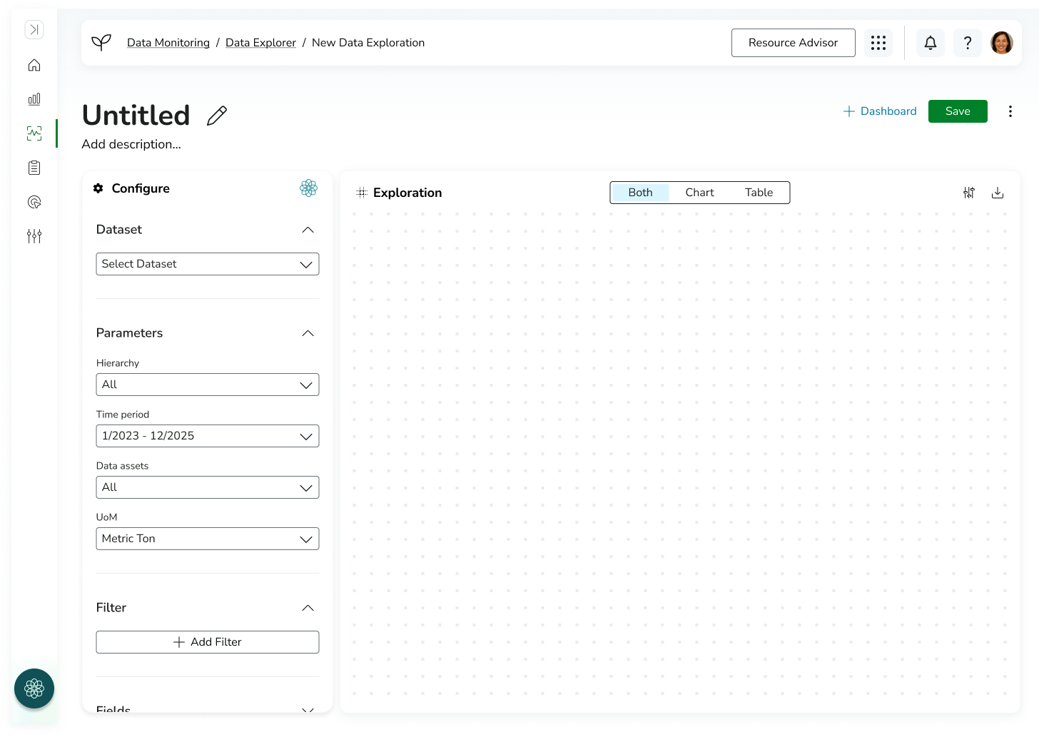
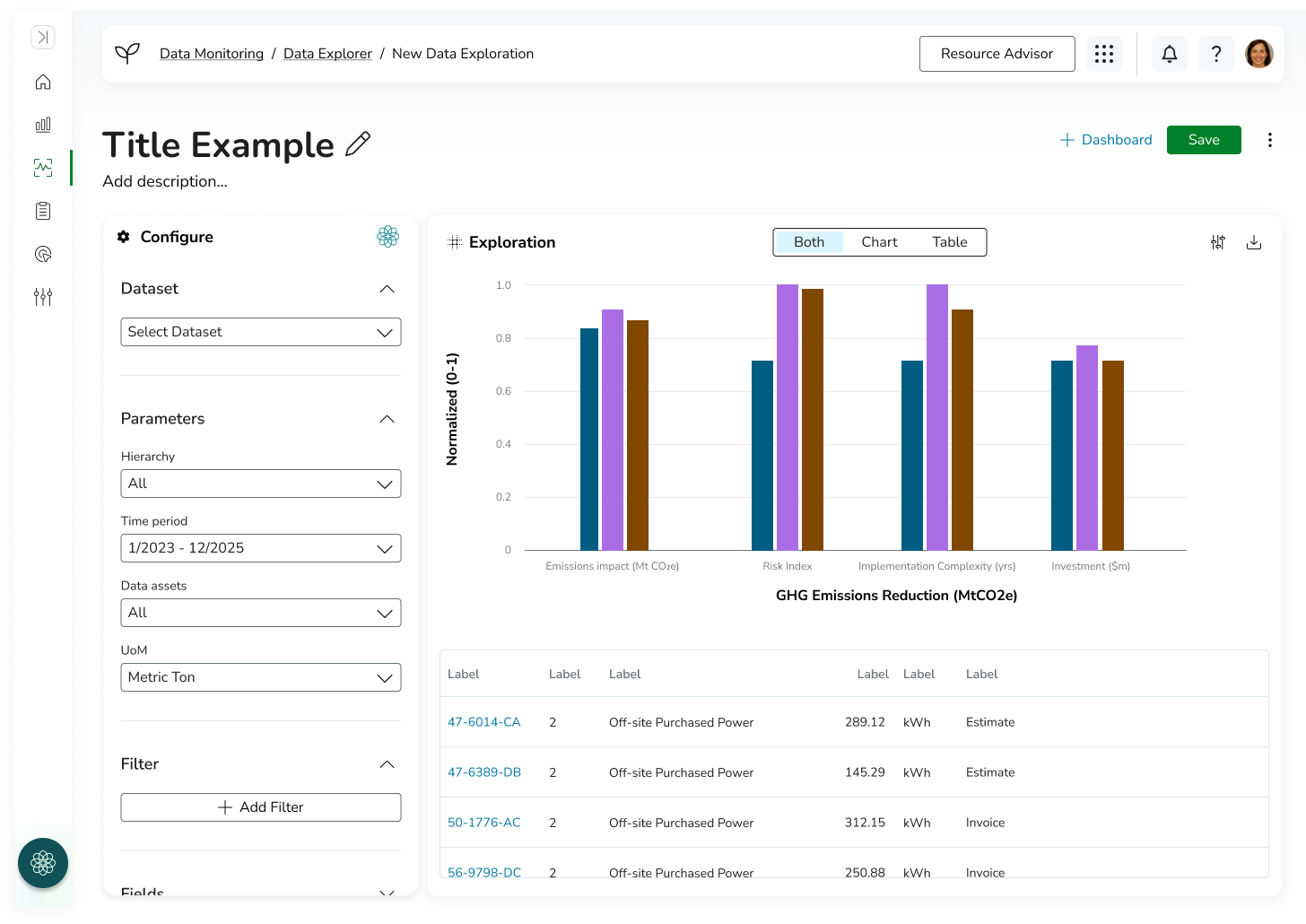
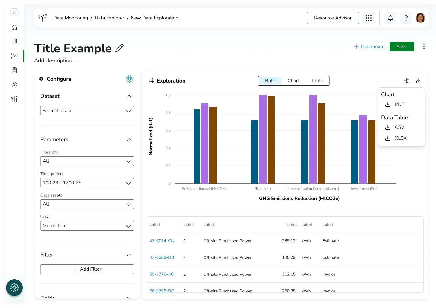
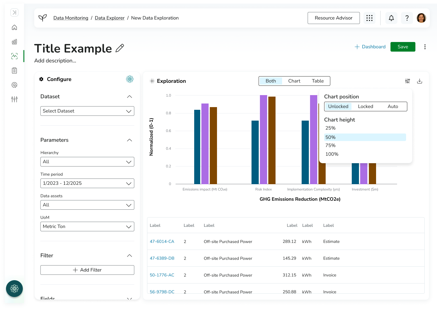
DATA VISUALIZATION BUILDER
The first part of the solution focused on enabling users to create custom data visualizations.
To simplify a highly configurable workflow, I designed a two-panel visualization builder that separated configuration from output to reduce cognitive load in a highly complex analytics workflow. On the left, users configured their visualization by selecting datasets, defining parameters, applying filters, choosing visualization types, and assigning dimensions and measures. On the right, users received immediate visual feedback through dynamically generated charts and tables.
This allowed users to understand the impact of configuration changes immediately, without needing to repeatedly run queries or navigate away from the builder, while maintaining a clear separation between configuration and output. To support different analysis needs, users could toggle between viewing the chart, table, or both simultaneously. Advanced display settings were also available for users who required additional control over presentation and compatibility across different pages and use cases.
The final experience enabled users to build, preview, and export custom visualizations while maintaining a streamlined and approachable workflow.
-
![]()
Create New Data Visualization (Empty)
-
![]()
Create New Data Visualization (Filled)
-
![]()
Download Menu Open
-
![]()
Configure Menu Open
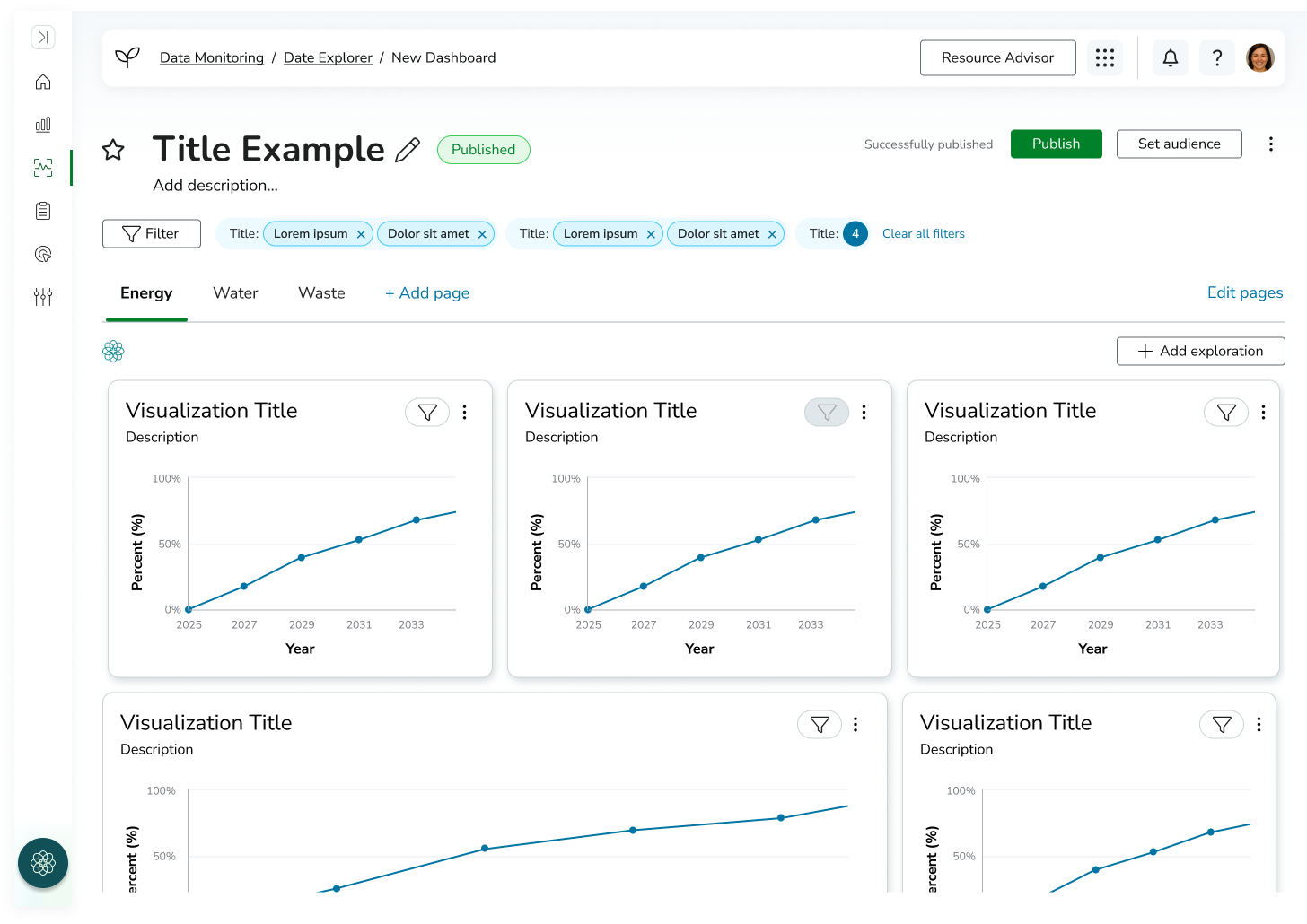
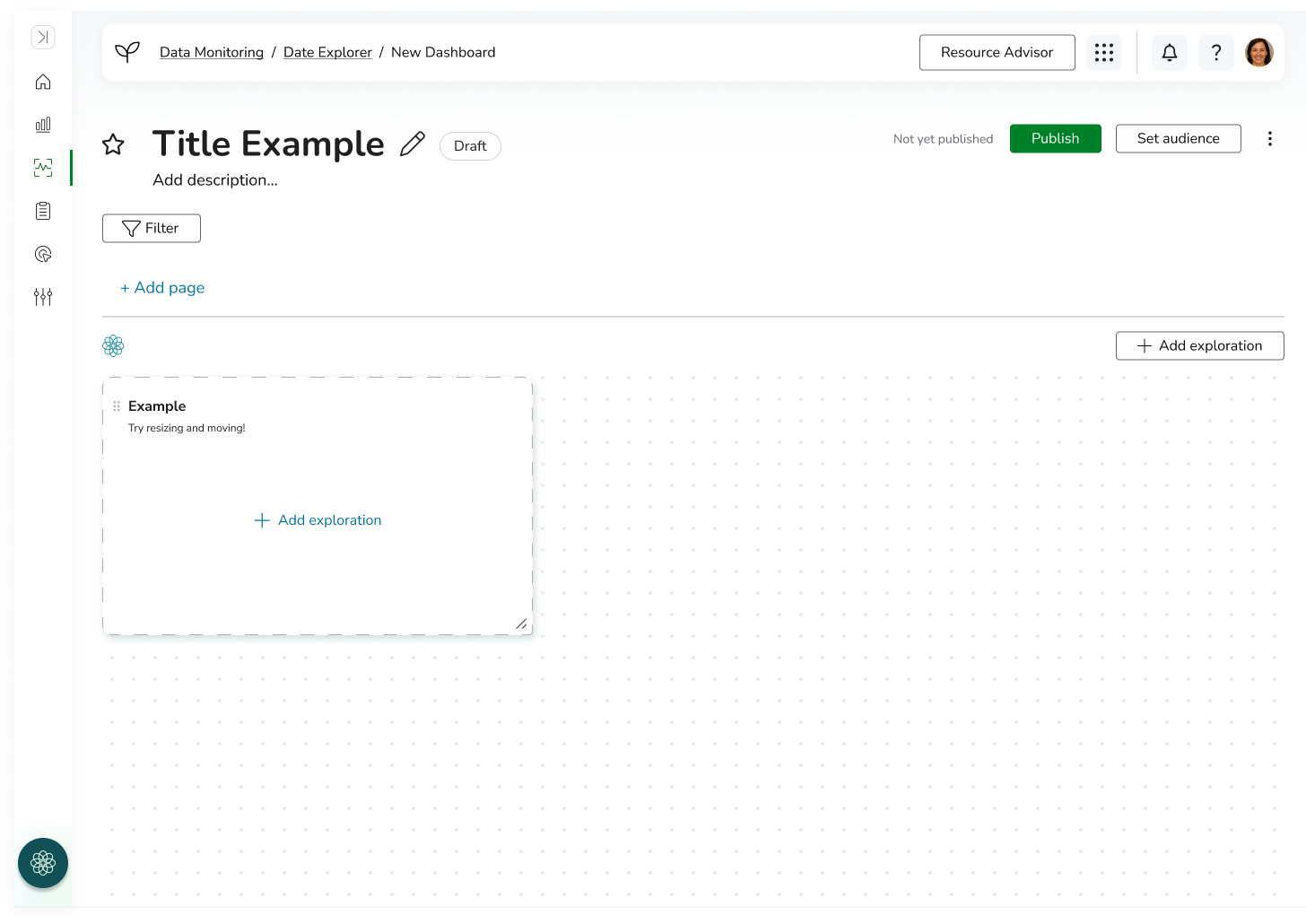
DASHBOARD BUILDER
Once users could create visualizations, the next challenge became helping them organize and communicate insights effectively.
I designed a dashboard-building experience that allowed users to assemble multiple visualizations into a centralized reporting space. Users could create custom dashboards tailored to specific goals, teams, or locations, bringing related information together into a single view.
To support more complex reporting needs, dashboards could contain multiple pages. For example, a sustainability manager could create a site-specific dashboard with separate pages dedicated to energy, water, and waste performance. This structure provided flexibility while maintaining organization and clarity.
By building dashboards around reusable visualizations, users could efficiently create reporting experiences without duplicating work, creating a scalable system for analytics and decision-making.
-
![]()
New Dashboard (Empty)
-
![]()
New Dashboard (Filled)
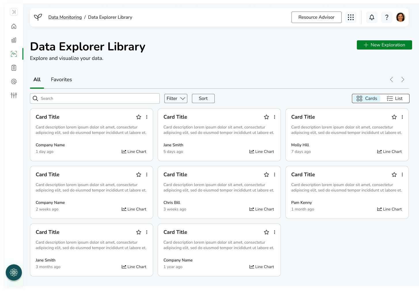
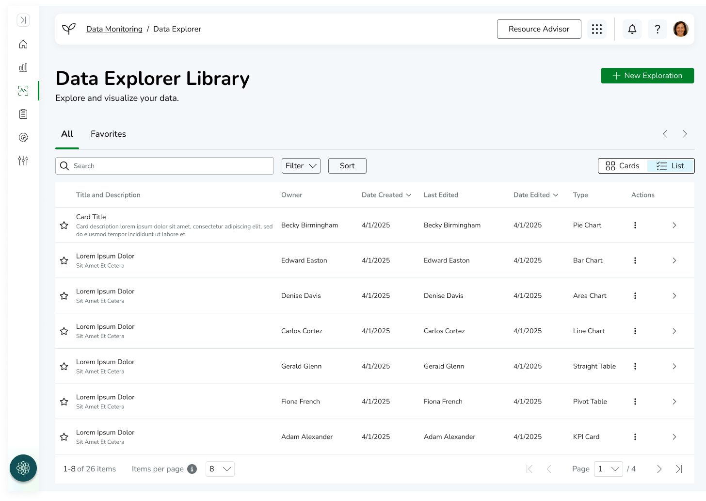
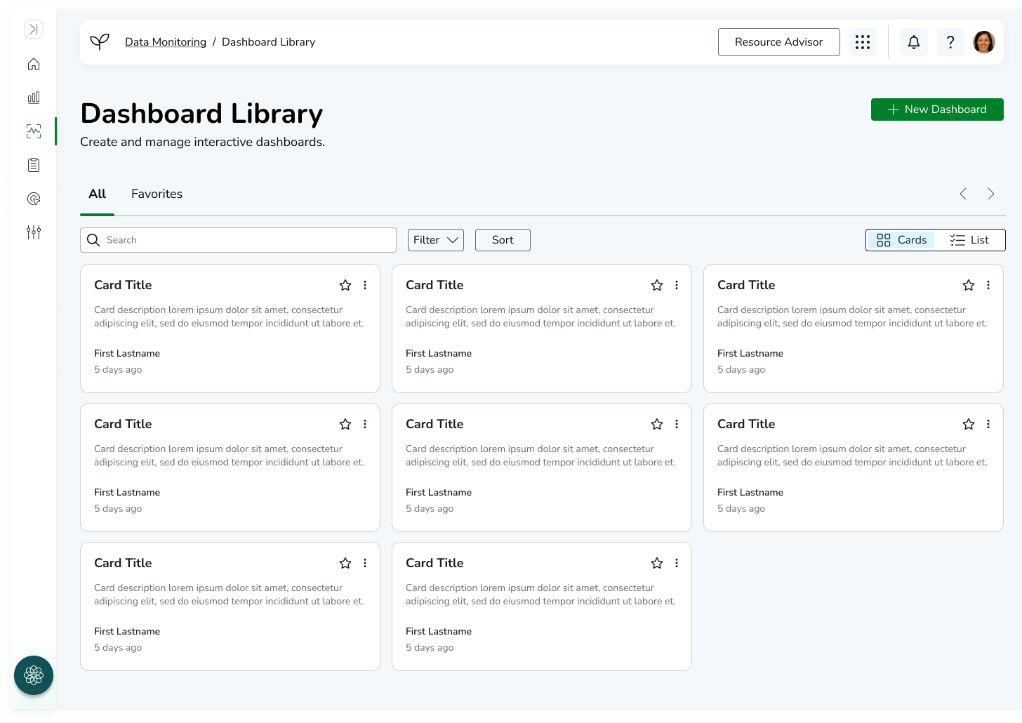
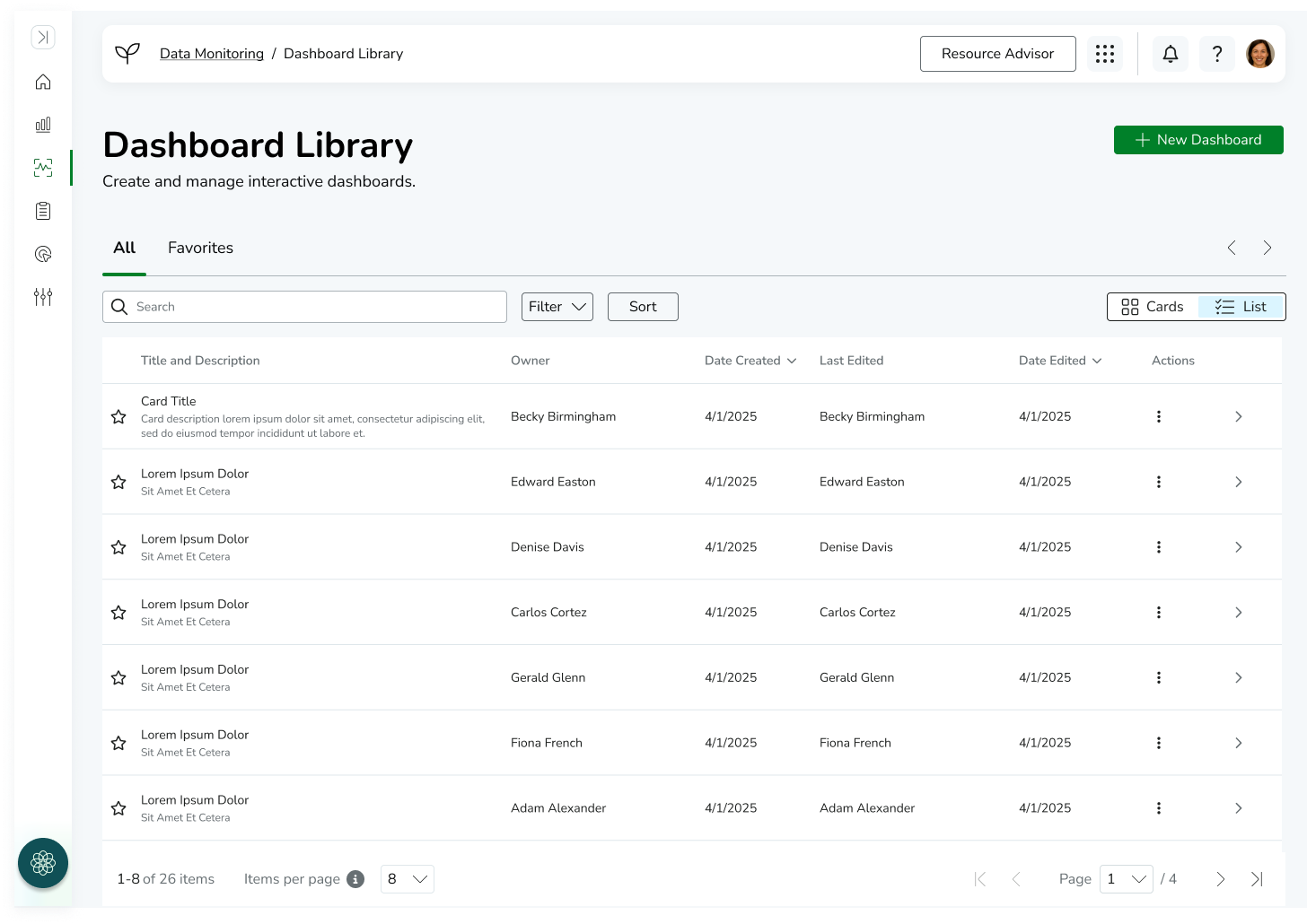
Data Visualization & Dashboard Library
In addition to the visualization and dashboard builders, I designed supporting “home” experiences for each workflow to help users manage and access their work efficiently.
The Visualization Library served as a central hub where users could browse, search, and manage previously created visualizations. This allowed users to reuse existing work rather than recreate reports, supporting scalability and consistency across teams.
Similarly, the Dashboard Home page provided a centralized space for managing dashboards, enabling users to quickly access, organize, and continue editing reporting structures.
These surfaces were designed to reinforce the overall system architecture by separating creation workflows (builders) from management workflows (home/library views), ensuring the platform supported both generation and long-term usage of analytics assets.
-
![]()
Data Explorer Library - Card View
-
![]()
Data Explorer Library - List View
-
![]()
Dashboard Library - Card View
-
![]()
Dashboard Library - List View
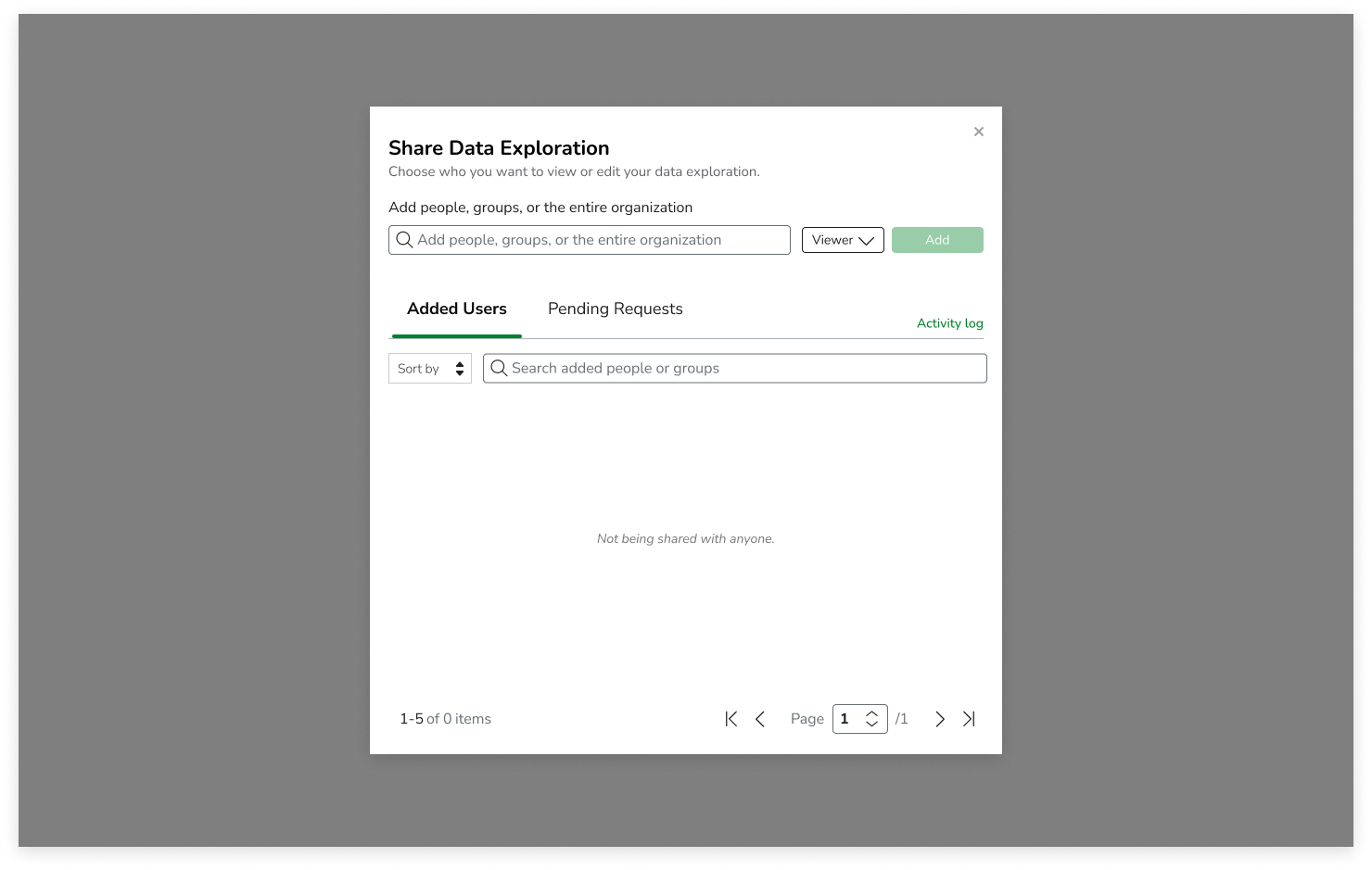
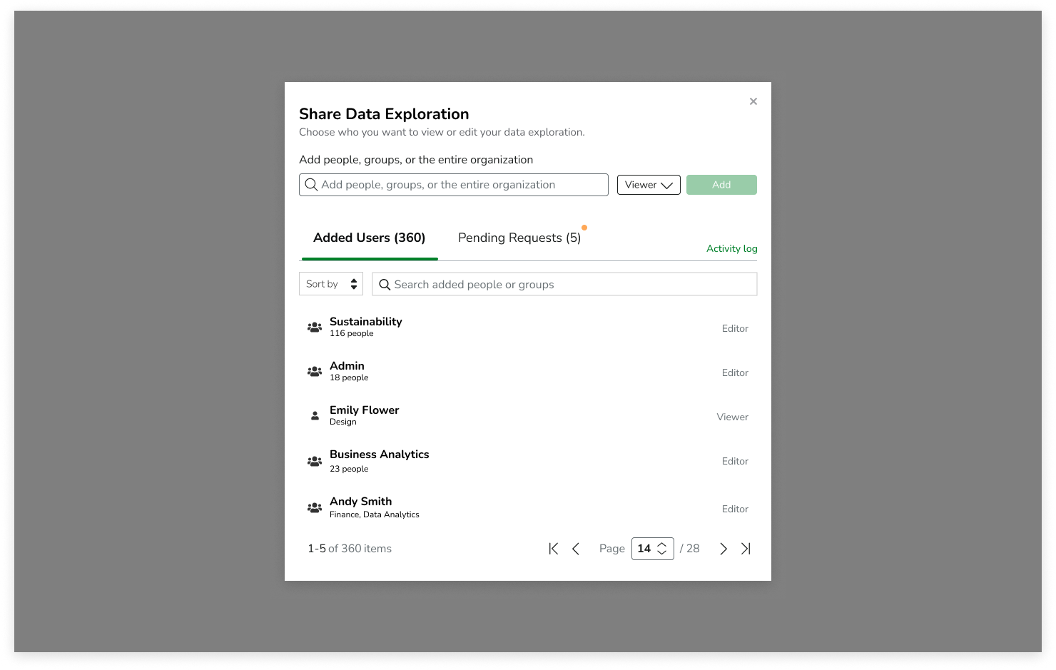
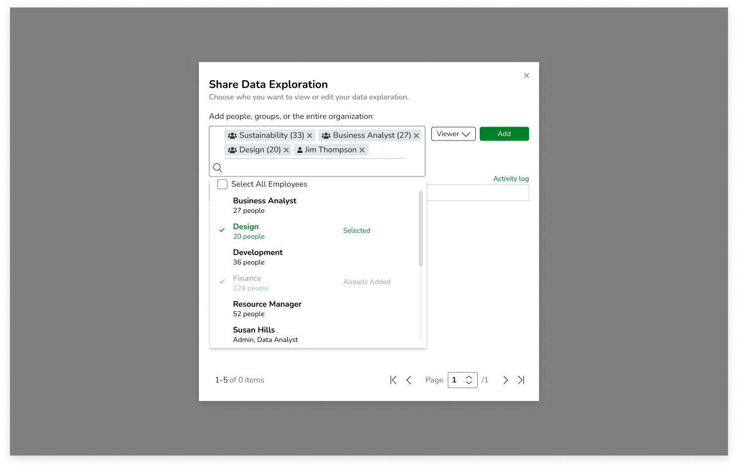
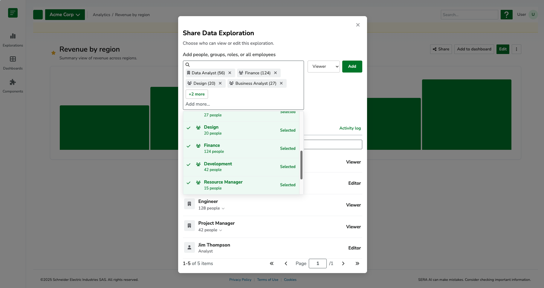
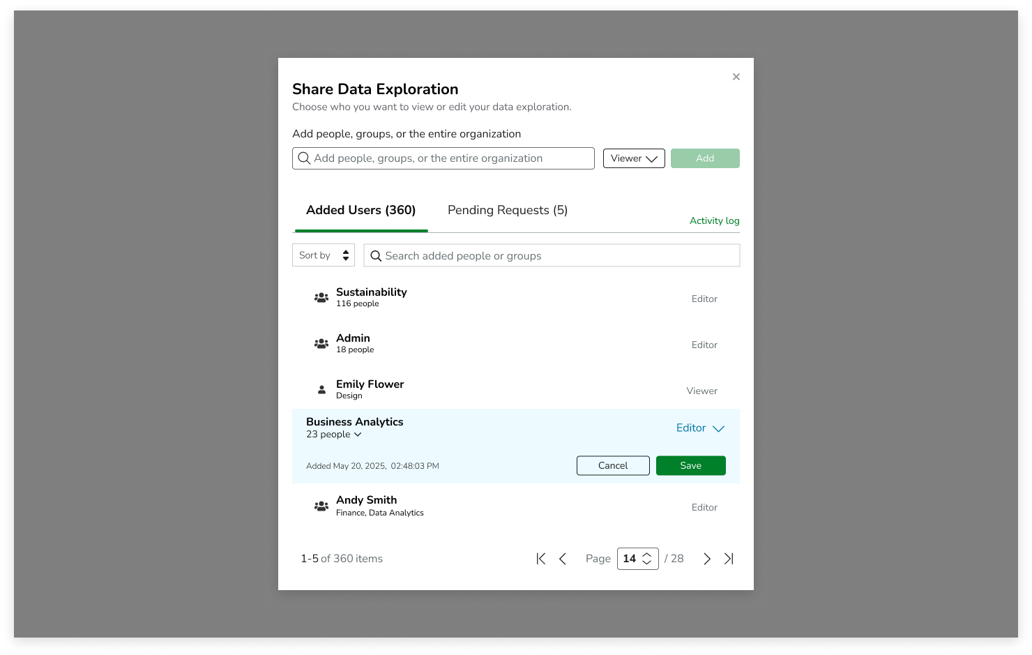
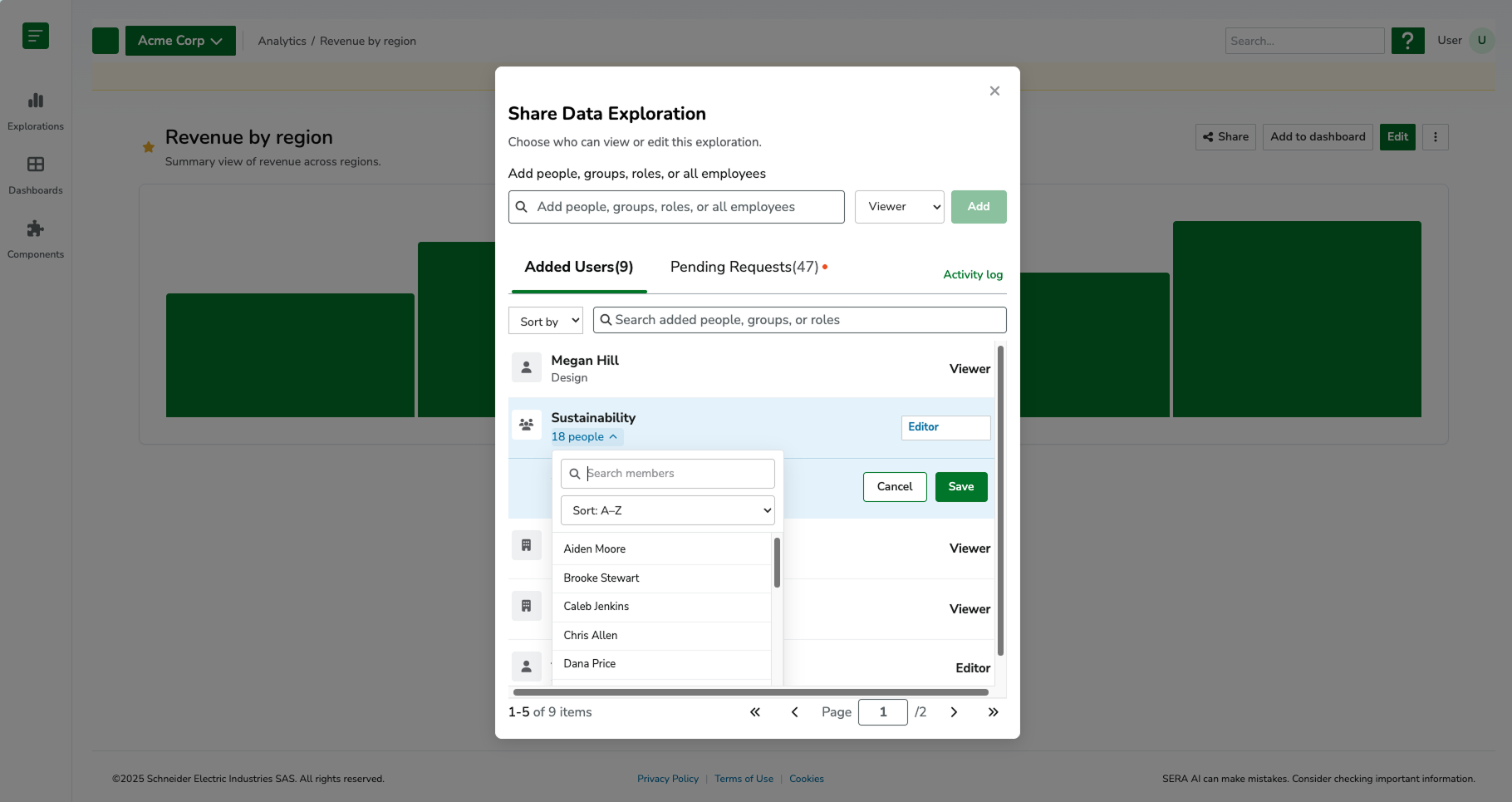
COLLABORATION & DISTRIBUTION
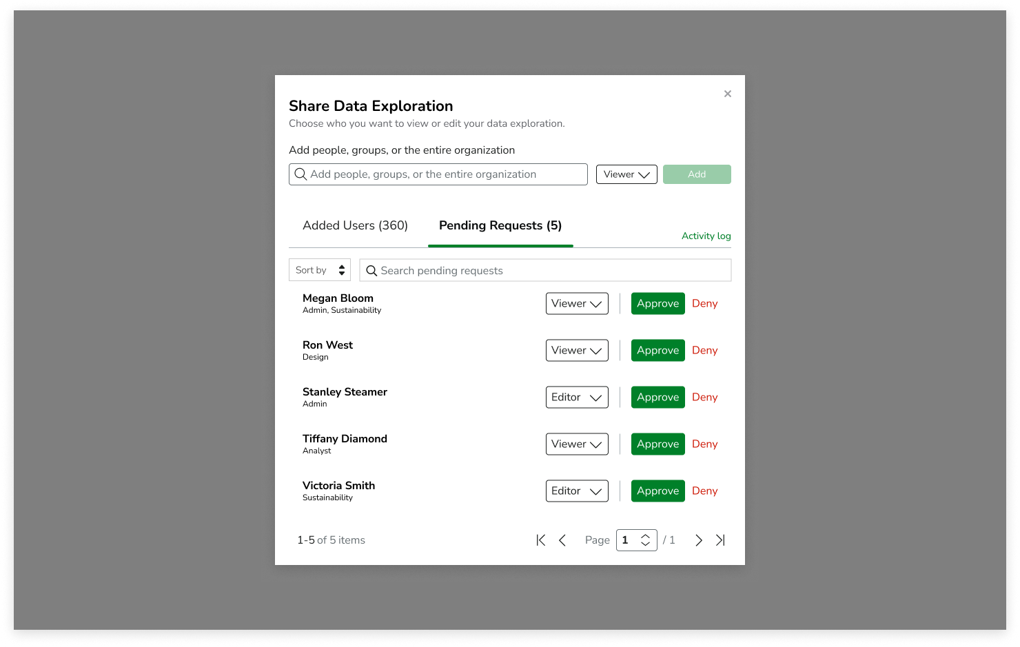
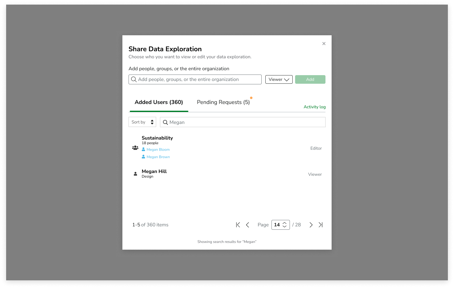
Analytics are most valuable when insights can be shared and acted upon. To support collaboration, I designed a flexible permissions and sharing model that allowed users to distribute visualizations and dashboards to individuals, user roles, or entire organizations.
This ensured reporting could scale beyond the original creator while maintaining consistency, reducing duplicated work, and increasing visibility across teams. The sharing system became a critical component of the broader analytics ecosystem, supporting how organizations communicate and act on sustainability performance.
For this, I started out designing in Figma and then switched to Cursor AI to finish the designs and edge cases.
-
![]()
Sharing (Empty)
-
![]()
Sharing (Filled)
-
![]()
Adding individuals and roles
-
![]()
Adding users (more than 4)
-
![]()
Adding users (more than 4) - viewing additionals
-
![]()
Viewing metadata
-
![]()
Viewing metadata - users in a role
-
![]()
Pending Requests
-
![]()
Searching added users

ACCESSIBILITY
Because the analytics experience relied heavily on charts, tables, and complex data interactions, accessibility was a core consideration throughout the design process. I worked closely with stakeholders to ensure visualizations remained accessible to users relying on assistive technologies.
Since charts and graphs cannot be fully interpreted by screen readers, I designed complementary data tables that presented the same information in an accessible format. Users could easily switch between visual and tabular representations of their data, ensuring insights were available regardless of how they consumed information. I also considered alternative text requirements, labeling, keyboard navigation patterns, information hierarchy, and component consistency to support broader accessibility goals across the platform.
These decisions helped create a more inclusive analytics experience while advancing alignment with WCAG accessibility standards and ensuring complex sustainability data remained understandable for all users.
VALIDATION & TESTING
Usability testing was conducted specifically on the data visualization builder, focusing on core workflows such as dataset selection, applying filters, configuring dimensions and measures, and switching between visualization types.
Earlier iterations revealed usability friction in the layout structure, particularly in how much space was allocated to visualization and tabular output. The original design used a three-panel layout combining configuration, visualization, and tabular data. However, as users began working with more complex datasets, the preview and table areas became constrained, limiting the ability to effectively interpret results.
This led to a redesign from a three-panel layout to a more flexible two-panel system with toggled views. I redesigned the experience to prioritize flexible data consumption over fixed layout structure, introducing a toggle-based system that allowed users to switch between visualization, table, or combined views based on their analysis needs. This shift improved readability for large datasets and better supported both exploratory analysis and detailed data validation workflows.
Final design concepts were validated through usability testing with representative users. Participants were asked to complete key workflows, including creating visualizations, configuring datasets, applying filters, and building dashboards.
All participants successfully completed assigned tasks, demonstrating that users could confidently navigate even advanced analytics workflows. Feedback highlighted the clarity of the interface, intuitive organization of controls, and overall ease of use despite the complexity of the underlying data structures. The findings provided confidence that the designs successfully balanced advanced functionality with an intuitive user experience.
It’s important to note that testing was limited to the visualization builder experience. The dashboard builder and collaboration/sharing workflows were designed but not yet validated with end users due to project timeline constraints.
SYSTEMS THINKING
A key design consideration throughout the project was creating a connected ecosystem rather than isolated features.
The visualization builder and dashboard builder were intentionally designed to work together as part of a larger analytics workflow. Users first transformed raw data into reusable visualizations and then organized those visualizations into dashboards that supported reporting, monitoring, and decision-making.
By designing shared patterns, consistent interactions, and reusable components across both experiences, the platform could scale alongside future analytics capabilities while providing users with a cohesive and predictable experience.
First Iteration of Data Visualization Builder

Final Design of Data Visualization Builder
REFLECTION
This project reinforced the importance of designing and validating complex systems in stages rather than attempting to evaluate the entire experience at once.
While I was able to test the data visualization builder and iterate on its layout and interaction patterns, the dashboard builder and collaboration features were not yet validated with users due to time and delivery constraints. If I had additional time, I would focus on testing how users transition from individual visualizations into dashboards, and how they organize and share insights across teams. These workflows are critical to understanding whether the system truly supports end-to-end self-service analytics or whether users revert to analyst-supported reporting processes.
This experience also highlighted the importance of validating not just individual features, but the connections between workflows in complex enterprise systems.