Schneider Electric:
Modernizing Legacy Page
TIMELINE
October 2025 - November 2025
MY ROLL
Product Designer
SOFTWARE USED
Figma
SUMMARY
This project focused on modernizing a high-traffic legacy page within Schneider Electric’s sustainability platform, Resource Advisor Classic. The page allowed users to browse site locations and view associated account information, but the existing experience had usability and customization limitations that impacted efficiency and overall user experience.
I collaborated closely with a business analyst to understand project requirements, conducted conversations with users to better understand their workflows and pain points, and worked alongside developers throughout the design process to ensure technical alignment and feasibility.
After synthesizing business and user needs, I proposed an initial design solution intended to significantly improve the browsing and customization experience. However, through collaboration with engineering, we discovered that the proposed solution was not technically feasible within the constraints of the existing backend architecture.
Rather than treating this as a blocker, I used it as an opportunity to rethink the experience and design a more scalable solution. The final design introduced a new approach to table customization within Resource Advisor Classic, improving flexibility, visibility, and usability while remaining compatible with technical constraints. This project reinforced the importance of cross-functional collaboration, adaptability, and balancing user needs with real-world implementation considerations.
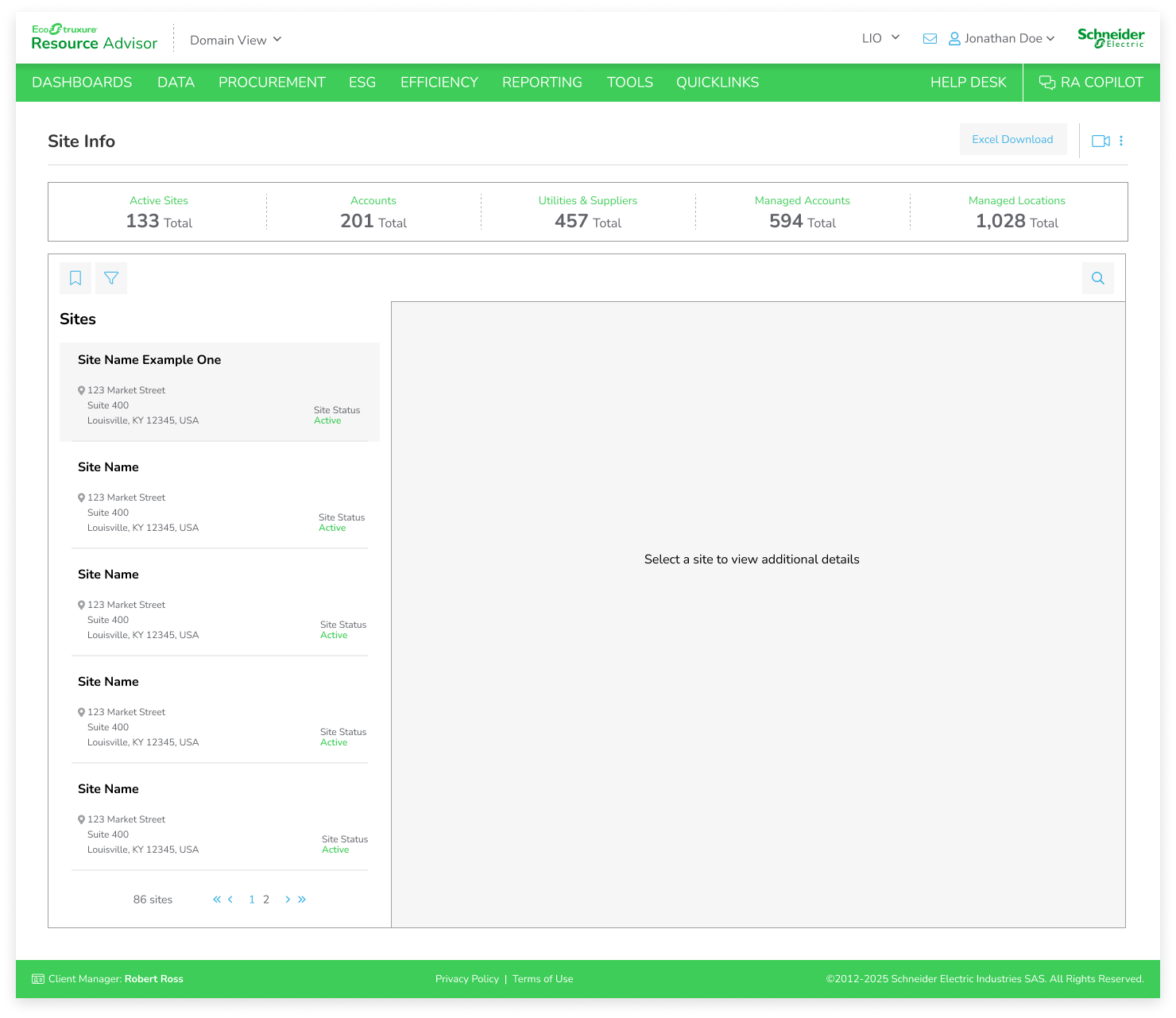
LEGACY PAGE
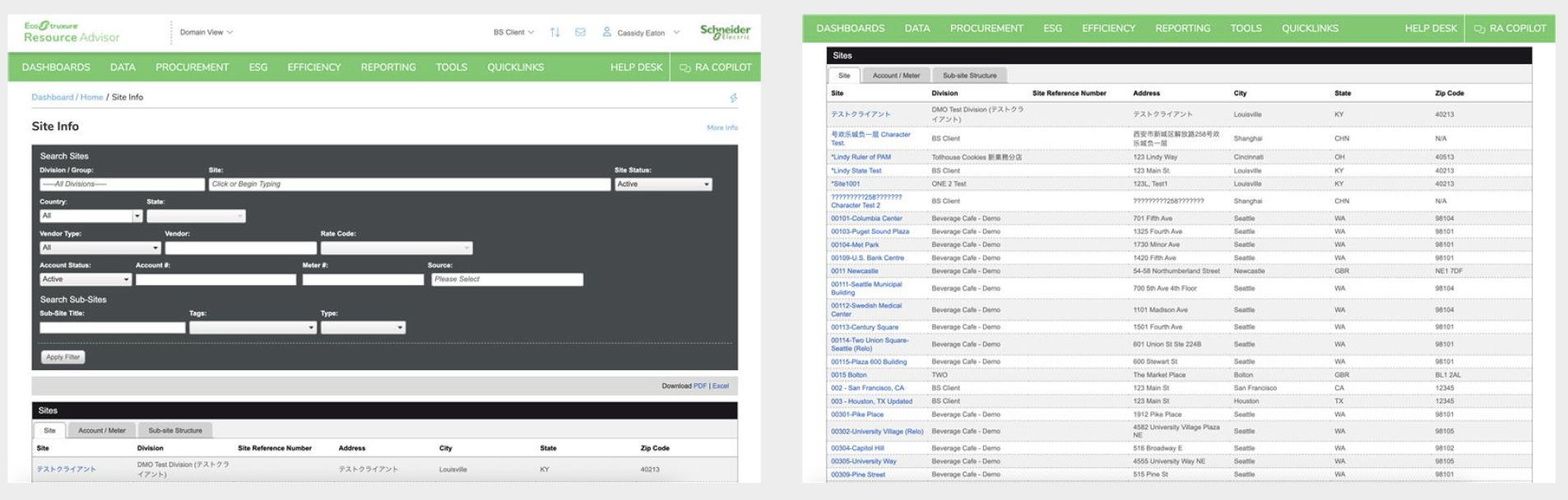
In the legacy page, users can use a simple filter at the top of the page or browse a tabbed table below. The table has three tabs: site, account/meter, and sub-site structure. The site tab displays information about the site location. The Account/meter tab displays a site’s account and meter information. A site can have multiple accounts, and an account can have multiple meters. And the sub-site structure has more site info.
USER INTERVIEWS
ITERATION 1
For the first iteration of the redesign, I explored a solution that allowed users to view multiple sites at once while still providing access to deeper account details when needed. The concept aimed to solve the frustration users expressed around switching between tabs by creating a more centralized and efficient browsing experience without overwhelming them with excessive information at once. Users can already create and save filtered views on this page, allowing them to quickly access the specific sites most relevant to their workflows instead of navigating through unnecessary data.
Initial discussions with the business analyst were very positive, as the solution aligned closely with both business goals and user needs. However, after collaborating with developers, we identified backend limitations that made the proposed experience technically unfeasible within the existing system architecture. This required me to reevaluate the approach and redesign the experience within a new set of technical constraints.
To better understand user behaviors and pain points after getting the project from the business analyst, I conducted interviews with five users who regularly interacted with the legacy page. Through these conversations, I discovered that users were frustrated with having to switch between multiple tabs to access related information, creating a fragmented and inefficient experience. Many users expressed a need to view critical account and site information simultaneously to improve workflow efficiency and reduce unnecessary navigation.
I also learned that most users were typically visiting the page to locate one or two specific sites rather than browsing the full dataset. As a result, much of the information displayed by default was considered unnecessary and contributed to cognitive overload. These insights helped shape the direction of the redesign by emphasizing visibility, customization, and quicker access to the most relevant information.
-
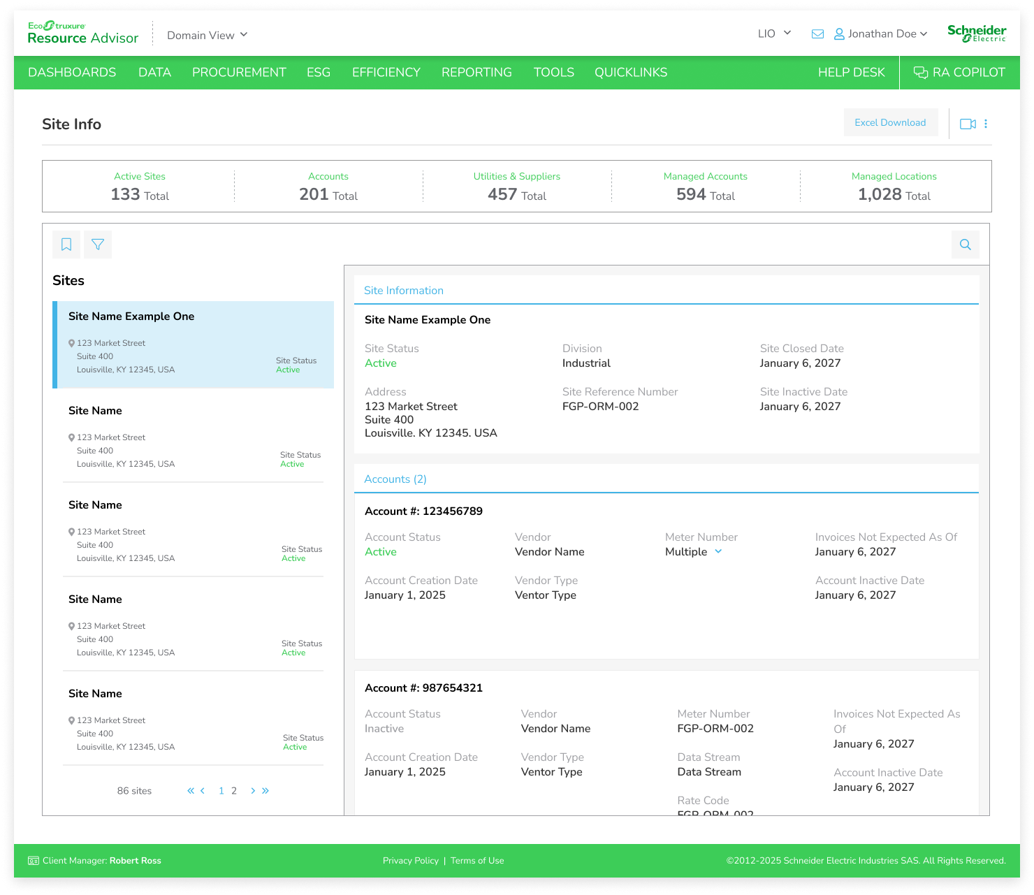
![]()
Site Selected - displaying info and accounts
-
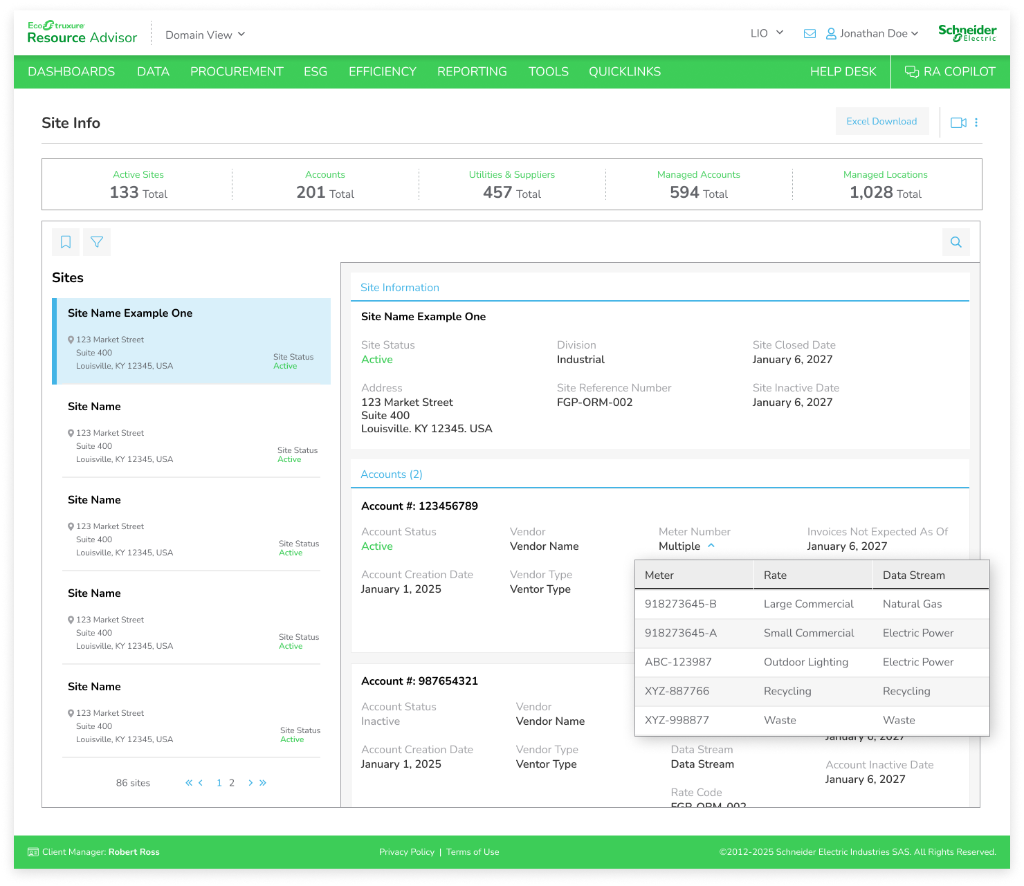
![]()
Multiple Meters Dropdown
-
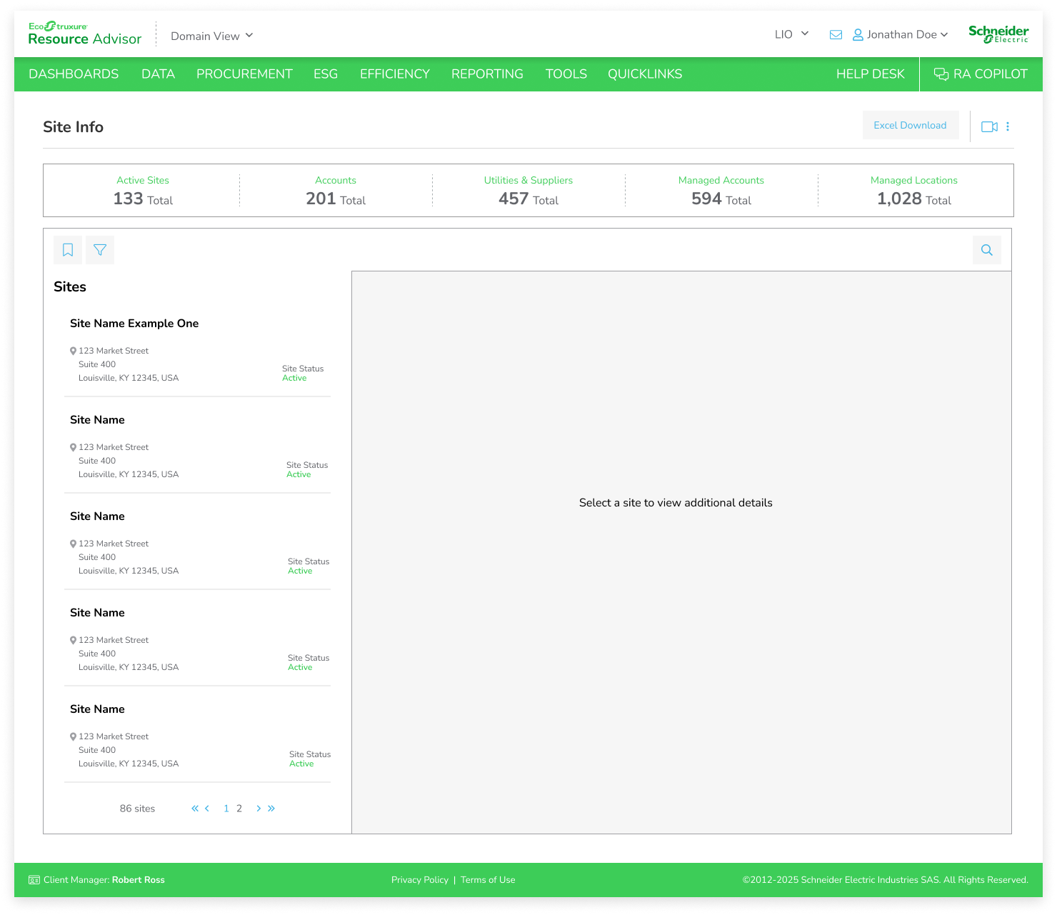
![]()
Default State - no site selected
-
![]()
Hover State
ITERATION 2 - FINAL DESIGN
Working on this project reminded me just how valuable thorough planning and research really are. By taking the time to do proper desk research, competitive analysis, and multiple rounds of interviews, I was able to gain a much deeper understanding of the problem space and the perspectives of different stakeholders. This level of insight made me feel far more confident in my design decisions because I wasn’t designing in a vacuum; I was grounding every choice in evidence and real-world experiences.
The user interviews, in particular, were incredibly impactful. They helped refine the direction of the project, confirming some of my hypotheses while challenging others. Listening to patients, caregivers, and physicians revealed what people truly needed, where they felt the most friction, and what they actually valued. It was a strong reminder that design is about solving for real needs, not assumptions.
Another key takeaway was the importance of flexibility. Early on, I considered incorporating AI-generated summaries as a core feature. But through my interviews, it became clear that this wasn’t what patients or physicians wanted—or needed. Both groups valued having access to accurate, centralized information more than AI-driven interpretation. In fact, introducing AI risked adding errors or confusion in a highly sensitive context. This experience reinforced the need to remain open to changing direction and stripping away features that don’t directly serve users’ goals.
Overall, this project has been a powerful reminder that empathy, evidence, and iteration are at the heart of good design.