Master’s Capstone Project:
Uniting Fragmented Medical Data
TIMELINE
May 13, 2025 - August 28, 2025
MY ROLL
UX Designer and Researcher
SOFTWARE USED
Figma/ FigJam
Google Forms/ Sheets
SUMMARY
This project explores the challenge of fragmented medical data across multiple patient portals and its impact on patients, caregivers, and physicians. Chronic illness patients often juggle three to five different portals just to access test results, appointments, and messages, leaving them overwhelmed and disengaged. Parents managing children’s care face the added burden of switching between multiple accounts, missing reminders, or overlooking abnormal results. Physicians are forced to work with incomplete information, which results in repeated tests causing unnecessary expenses and delays that can directly affect the quality of care.
I completed thorough desk research, competitive analysis, surveys, 9 user interviews, and 5 usability tests to explore this problem. I identified a clear need for a unified medical dashboard that brings together patient records, appointments, and communication in one place. My proposed solution empowers patients and caregivers to consolidate portals, create customizable care summaries for doctor visits, and manage family care with clarity. For physicians, it delivers scannable, accurate summaries that cut down on wasted time and redundant testing. Ultimately, the project demonstrates the feasibility and design opportunity of a centralized, patient-facing tool that restores clarity and control in healthcare management.
PROBLEM STATEMENT
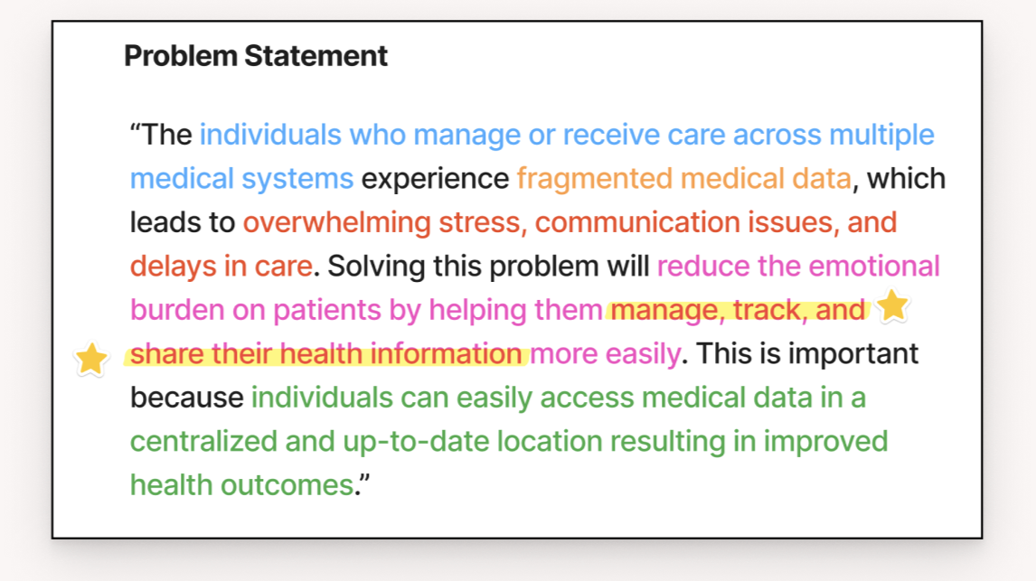
“The individuals who manage or receive care across multiple medical systems experience fragmented medical data, which leads to overwhelming stress, communication issues, and delays in care. Solving this problem will reduce the emotional burden on patients by helping them manage, track, and share their health information more easily. This is important because individuals can easily access medical data in a centralized and up-to-date location, resulting in improved health outcomes.”
Key: [stakeholder group], [problem], [negative impact], [positive outcome or benefit], [reason/impact]
FEASABILITY
Technical Feasibility: It is technically possible to integrate with existing patient portals like Epic’s MyChart using SMART on FHIR standards. These APIs allow third-party apps to securely access patient records (such as lab results, medications, and appointments) once the patient grants permission. Other major EHR systems (Cerner, Allscripts, Athenahealth, etc.) also support FHIR under the 21st Century Cures Act, meaning a unified dashboard can scale across systems without requiring custom integrations for each hospital.
Developer Access: Platforms like Epic’s App Orchard and other vendor developer portals make APIs available to outside apps. While compliance with privacy and security standards is required, approval does not necessarily mean negotiating with each hospital.
Manual Entry & Uploads: Not all providers or patients have interoperable systems, so manual entry remains essential. Patients should be able to upload PDFs, images, or scanned results, and optionally input medications, symptoms, and notes. Features like OCR or tagging could improve usability and keep the data structured.
Privacy & Compliance: Because this system would handle protected health information (PHI), it must comply with HIPAA. That includes encrypting data at rest and in transit, audit trails, role-based access, and secure authentication. Clear privacy policies and HIPAA-compliant infrastructure are non-negotiable.
Market Precedent: Existing solutions (Apple Health Records, OneRecord, MyLinks, CareEvolution) already aggregate health data for patients. Their existence shows both demand and technical precedent, but gaps remain in usability, family management, and actionable insights.
COMPETITIVE ANALYSIS
I analyzed 11 total competitors, a mix of direct and indirect. While some companies solve parts of the problem, none fully address it.
Direct Competitors - Patient-Facing Portals & Aggregators
Companies: Epic MyChart, OneRecord, PatientMpower, CareSpace
Strength: Provide patients direct access to their medical records and test results in one place.
Weakness: Limited to single-system data (MyChart) or basic aggregation without caregiver/multi-profile support (OneRecord, PatientMpower).
Indirect Competitors - Condition-Specific or Practice Management
Companies: Tempus Olivia, DRChrono/OnPatient, Azumio (Argus, Sleep Time)
Strength: Highly tailored to niche use cases (oncology, fitness tracking, or practice efficiency).
Weakness: Not designed for managing multiple systems or giving a full-picture medical history for complex patients/caregivers.
Back-End Competitors - Data Networks & APIs
Companies: Health Gorilla, Redox, Lumiata, Otto
Strength: Strong technical backbone for data exchange and integration across systems.
Weakness: Not patient-facing; they solve interoperability at the provider/developer level, not at the patient or caregiver level.
PERSONAS
I started to really hone in on who I was solving a problem for. My target audience will be adults (18–45) living with one or more chronic illnesses or managing other people's medical data (such as a parent), who see multiple doctors across different medical systems.
These users often struggle with keeping track of medical data and scheduling information, information overload, scheduling conflicts, remembering login information, and feeling unheard in appointments.
This product will help them:
Save time
Feel more prepared and in control
Communicate more effectively with providers
Maintain more accurate, comprehensive records
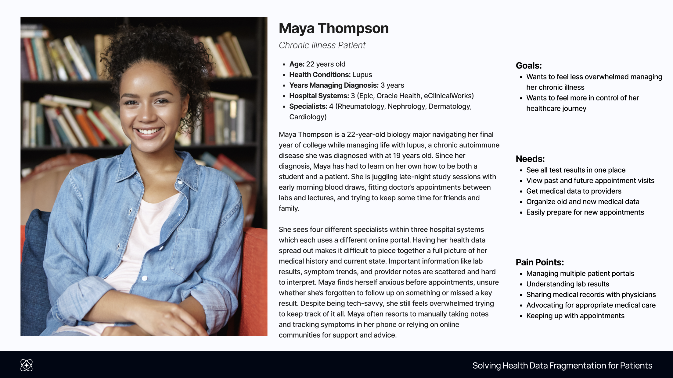
For my first persona, I have Maya, a 22-year-old college student diagnosed with Lupus three years ago. She sees four specialists across three hospital systems and spends hours checking for updates and preparing for visits. Maya is overwhelmed and wants to bring everything together and take control of her health.
View additional details for my chronic illness patient persona (Includes: 5 W’s Analysis, Connect Persona to Problem, Day-in-the-Life, ABT User Narrative, and Supporting Evidence).
Second, is Rachel. She’s a mom of three, and two of her kids have ongoing health conditions. Rachael wants to show up fully for her kids and make sure they are getting the best care. But she has to spend so much time managing it all. She needs a way to keep her family’s care organized so she can focus on what matters most.
View additional details for my parent persona (Includes: 5 W’s Analysis, Children’s Medical Privacy, Day-in-the-Life, ABT User Narrative, and Supporting Evidence).
SCREENER SURVEY
To start my research, I wanted to interview three specific user groups:
Chronic Illness Patients - Managing multiple portals & specialists
Parents / Caregivers - Juggling children’s portals & proxy logins
Physicians - Working with incomplete or fragmented patient data
I created screener surveys tailored to each user group. For example, here is a document that details my screener survey for chronic illness patients (includes: links, questions, responses, results, and criteria to be considered for the next stage).
Here are some interesting insights from the patient survey:
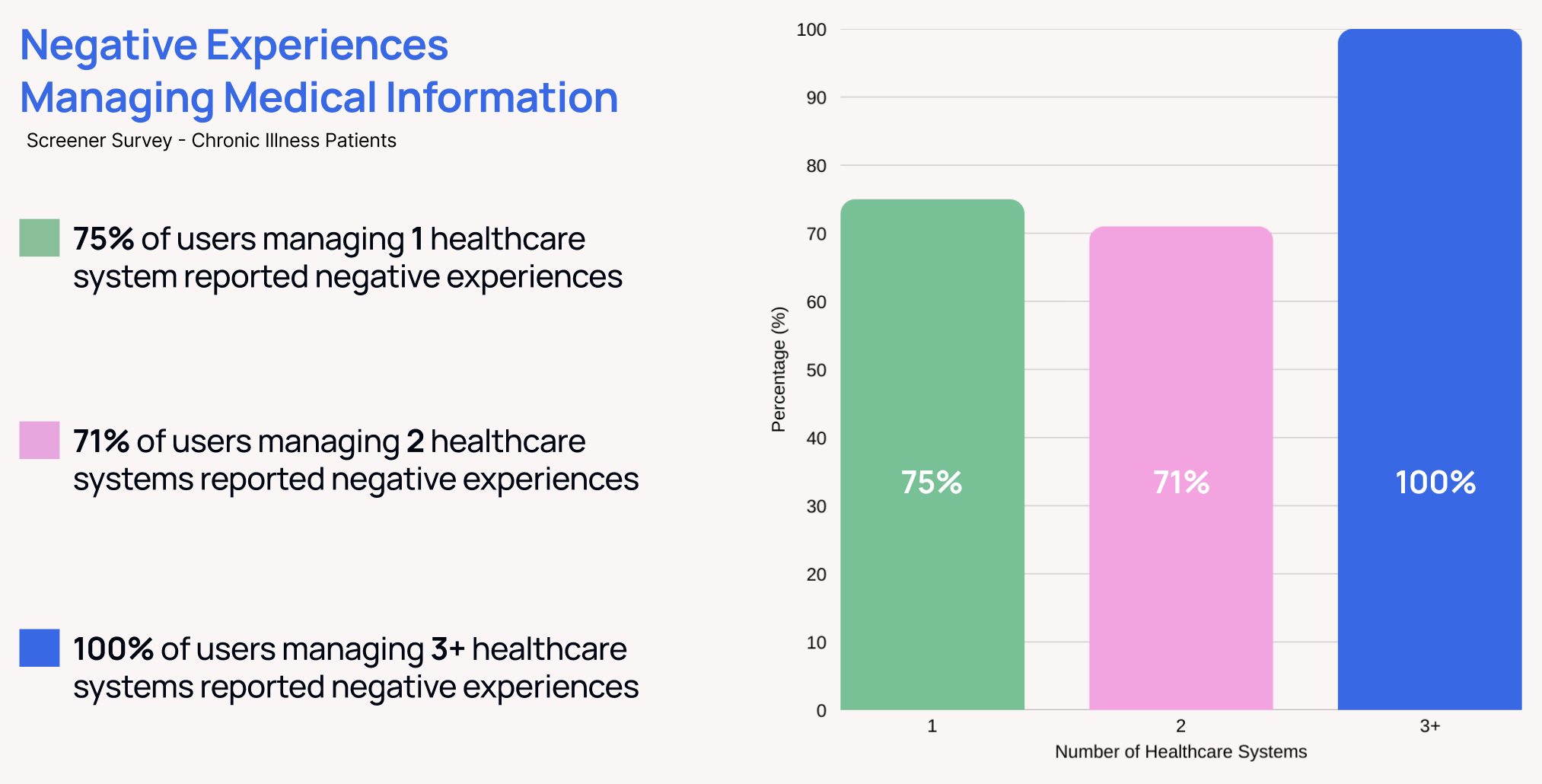
Around 73% of chronic illness patients managing one or two healthcare systems, and 100% of those managing 3 or more, had negative experiences managing their medical information.
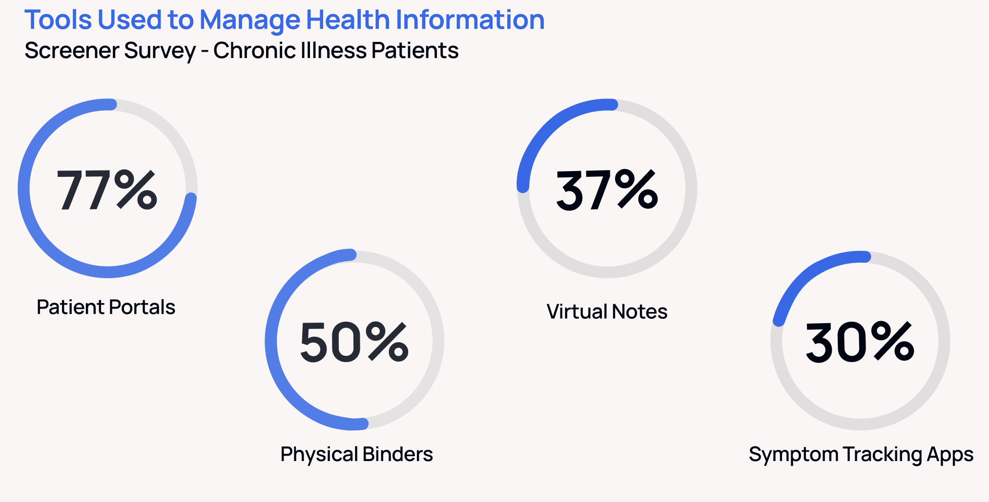
When asked what tools people used to help manage their health information, there were multiple tools mentioned in addition to the patient portals, like physical binders, virtual notes, and symptom tracking apps. Patients were building their own multi-tool systems to stay afloat. And my research showed it’s not because they want to, it’s because no single tool works well enough.
USER INTERVIEWS - GOALS
In total, I got responses from 51 people (46 chronic illness patients, 1 parent, and 4 physicians).
The screener survey for chronic illness patients had some great insights and left me with a variety of potential interview participants. After analyzing the responses, I ended up selecting a total of 9 people to conduct my user interviews with:
4 chronic illness patients who were managing 3+ medical portals
1 parent caring for 2 children with health conditions
4 physicians with 5+ years of experience. Each interview was designed to uncover specific pain points and opportunities
Each interview was designed to uncover specific pain points and opportunities.
Chronic Illness Patients (Script):
How do they feel about the way health information is shared and organized?
Have they had any negative health outcomes or experiences as a result of your medical data being across multiple systems?
How do they manage their medical data across multiple systems?
Are there any specific workarounds they have developed that really help them manage the fragmented data?
Parents (Script):
How are they managing multiple children’s portals?
How do they track appointments, test results, and communication with physicians?
Physicians (Script):
How and where do they receive patient data?
What patient medical information do they rely on most?
What is the impact of missing/incomplete data on care?
USER INTERVIEW - RESULTS
Chronic Illness Patients (4 interviews)
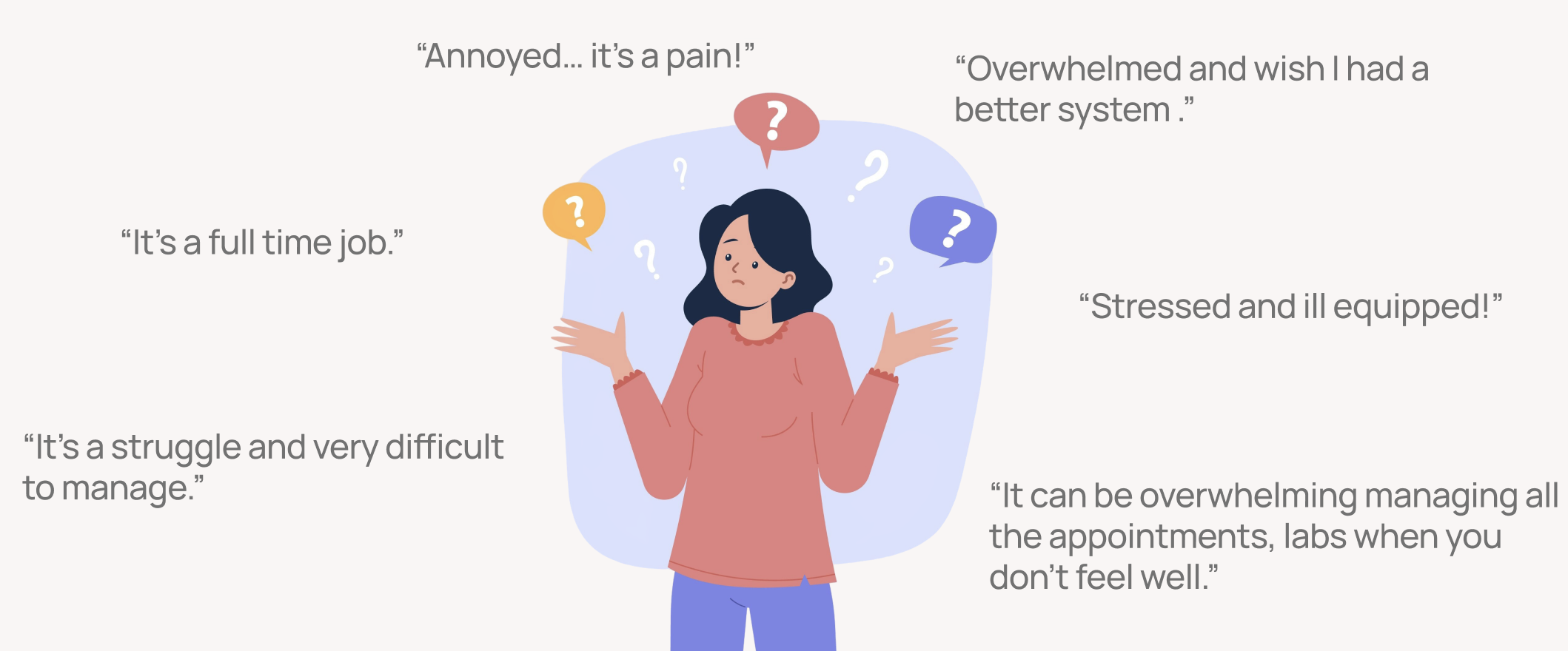
Experience: Managing care feels like a second full-time job. Most juggle 3–5 patient portals and often track test results, messages, and appointments.
Pain Points: Data fragmentation leads to frustration, overwhelm, and sometimes disengagement from care. Understanding lab results is especially challenging without context.
Needs & Wishes: A centralized place to view everything (labs, notes, appointments) and prepare ahead of visits. Many want tools to help them feel more in control of their healthcare.
Representative Quote: “I spend so much time logging in and piecing things together - it’s exhausting. If I had everything in one place, I could actually focus on getting better.”
Parent/Caregiver (1 interview)
Experience: Managing multiple children’s health portals across different hospital systems is overwhelming and time-consuming.
Pain Points: Missed reminders and delayed awareness of abnormal results due to scattered data. Confusion switching between children’s accounts.
Needs & Wishes: Easy profile switching, family calendar views, alerts for critical results, and consolidated reminders across systems.
Representative Quote: “It feels like I’m always one step behind, digging through portals and emails just to keep up with my kids’ care.”
Physicians (4 interviews)
Experience: Still receive many records via fax, scanned uploads, or patient handoffs. While systems like Care Everywhere help, data is often incomplete.
Pain Points: Missing or fragmented patient data slows decision-making, creates duplication (e.g., repeat labs), and wastes time for both doctor and patient.
Needs & Wishes: Physicians consistently want scannable, organized summaries that display test results, medication lists, prior visit notes, and medical history in one place. Open to patient-provided summaries if accurate and clearly structured. Concerns remain around AI interpretation if patients misread information.
Representative Quote: “What I need is a concise summary like labs, meds, and history.”
Cross-Group Insights
Unifying Theme: Data fragmentation impacts everyone, patients, caregivers, and providers, leading to wasted time, missed information, and frustration.
DESIGN OPPORTUNITIES
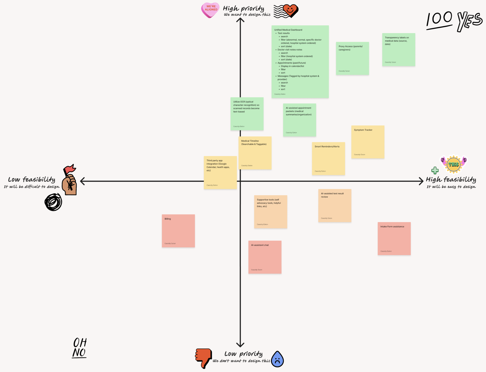
I started considering my design opportunities by listing every idea I picked up while talking to each user group. There ended up being a lot of opportunities to choose from:
-
1. Unified Medical Dashboard
Why: Patients like Maya currently log into 3–5 portals weekly to manage appointments, messages, test results, and bills.
“I log into different portals constantly, just to check if a message or test result is in yet.” → A centralized dashboard consolidates fragmented data, minimizing stress and improving oversight.
Multi-System Integration Panel
Connect to different health portals (via patient OAuth, API, or PDF upload).
Show all linked health systems in one place with status (connected, needs login, etc.).
Test Results
Grouped by date, provider, and type.
Highlighted abnormal results.AI-generated plain-language summaries with links to original documentation.
AI-identified trends (recommend questions to ask doctors)
Messaging Center
Unified inbox showing all messages from linked providers.
Tag or prioritize messages (e.g., follow-up needed, results pending, etc.).
2. AI AssistantWhy: Maya cross-references symptoms in Notes, menstrual apps, and Google Docs before appointments. She also needs to resend lab results manually.
“I wish I had something that could help me prep and know what to ask.” → The AI could summarize trends, flag missing info, and generate questions based on test history.
Create Relevant Appointment Packets
Select from uploaded/imported/scanned documents
Manually add more by upload/import/scan
Get all stuff together by using AI or manual
Can be made with relevant data for unique specialist appointments (ex: don’t need to add mental health data to an appointment with a nephrologist)
AI generate medical history (summary) based on all inputted data
AI Suggested/manually added questions
Test Result Summaries
Note trends
Highlight patterns
Recommend questions to ask/tests to run
Note abnormal results
Generate Medical History Summary
Medical timeline with links to relevant data
3. Automated Document Collection & OrganizationWhy: Interviewees described the challenge of gathering records from years of appointments, especially for disability claims or new doctor visits.
“I have a huge binder from trying to get disability… it took weeks.” → Auto-import tools (via FHIR APIs or PDF scan upload) can organize and timestamp medical records.
Upload/Import/Scanning Tools
Can select type for organization like blood tests, scans, appointment notes, etc
4. Smart Reminders and AlertsWhy: Appointments, billing dates, and lab availability often go unnoticed or arrive out of sync.
“I missed an appointment because it was listed wrong in one portal.” → Smart reminders, flagged inconsistencies, and prompts to follow up improve adherence.
Appointments & Reminders
Calendar view & List View
Chronological timeline of all upcoming & past appointments (across systems).
Smart alerts for incomplete follow-ups, unresolved results, or upcoming labs.
5. Personal Health Timeline + TagsWhy: Chronically ill users often track symptoms, flares, and medications over long timeframes.
“I have a Google Doc timeline but it’s messy.” → A dynamic, taggable health timeline with AI-searchable entries would help track patterns over time.
6. Intake Form AssistanceUsers can fill out once here and then refer back to it
Has typical intake questions & users can add more
Offer fill recommendations based on connected patient portal information?
-
1. Family View with Multi-Patient Management
Why: Parents like Rachel manage multiple portals for each child, each with unique logins, formats, and hospitals.
“Even just checking test results takes me half an hour per kid.” → A single login showing all dependents’ relevant info allows easier oversight.
2. Proxy Access Controls by AgeWhy: Caregivers want access—but also need to respect adolescent privacy (as required by HIPAA or portal policy).
“I want to see everything now, but eventually I know my kids need privacy.” → Role-based access should adapt as the child ages (e.g., limited views at 12+, editable settings).
3. Appointment & Test Result Summary by PriorityWhy: Rachel doesn’t have time to read through pages of lab data for each child.
“I feel like I’m missing something because I can’t go through it all.” → A dashboard that highlights abnormal results, upcoming follow-ups, and needed action saves time.
4. Prep Tools for AppointmentsWhy: Rachel wants a system to generate questions and send notes ahead of the visit.
“So much time is wasted repeating things, especially if results didn’t transfer.” → A form-based tool or AI feature to create “Visit Packets” for each child would streamline the process.
5. Integration with CalendarWhy: Caregivers juggle appointments, medications, school notes, therapy reminders, etc.
“It’s just a lot to remember. One missed thing can cause a spiral.” → Unified calendar integrations with exportable summaries and alerts reduce cognitive load.
-
1. ‘Patient packet’ with the provider in mind
Why: Alice confirmed a tool like this would be helpful if it’s curated and accurate.
Idea:
Simple - Include just what doctors value most:
recent labs
imaging results
current meds
visit summaries
Allow easy export/print/email for patients to hand off at visits
Note source info (uploaded by patient, imported from MyChart, etc)
2. Accuracy & trust for data
Why: “If it was updated accurately” is key!
Idea:
Label each item with its source
e.g., “Uploaded by patient,” “Imported from MyChart,” “Scanned from lab”Timestamp all records (date of last update)
3. AI Role: Assistant, Not Diagnostician
Why: Physicians worry about AI misinterpreting data. Idea:
Use AI for summaries & organization:
Yes: “5 tests since last visit,” “3 medication changes”
Avoid: “This means X” medical interpretations unless linked to vetted sources like Mayo Clinic or NIH.
4. Provider Review Periods
Why: Physicians value that 48-hour review window.
Idea:
Clearly label what has/has not been reviewed, if possible
Show once reviewed?
5. Accurate Medication List
Why: Discrepancies between systems cause issues.
Idea:
Include a “medication list checker” that highlights conflicting or duplicate entries from different providers.
6. OCR for Scanned Documents
Why: Physicians want digital records that aren’t just static images. They want data they can quickly search, copy, paste, and integrate into their workflow.
Idea:
Utilize OCR (optical character recognition) so scanned records become text-based, searchable, and copy/paste friendly for providers.
I then identified the highest value ideas by relevance to the problem statement. I really wanted to remember the core goal: to help patients manage, track, and share their health information.
From here, I created a prioritization matrix so I was focusing only on opportunities that were a high priority and feasible within the constraints for my class.
Ultimately, I landed on some primary solutions.
For patients with chronic illnesses, they need a unified dashboard—a single place where patients can view everything and share it with their doctors. This would reduce stress and give patients a stronger sense of control over their healthcare journey.
Parents/caregivers need a family view, where they can easily switch between profiles, see all appointments in a shared calendar, and quickly go through new notifications to give them confidence that nothing critical is being missed.
Physicians told me that they need to see a scannable view of a patient’s medications, test results, and prior visit notes. This is another reason why a health summary packet is such a powerful opportunity. It can save providers time and help them deliver better care while also reducing the burden on patients.
Final Design Opportunities:
Centralized dashboard for patients and caregivers to manage multiple portals.
Family-oriented features (profile switching, shared calendar, alerts).
Exportable, structured health summaries for physicians that reduce duplication and delays.
JOURNEY MAPS
With a solid understanding of what design opportunities were most important. I started on journey mapping important processes. I looked at the current state (as the process is today) and a potential future state (implementing my solution).
My first set of journey maps was for chronic illness patients prepping for a specialist appointment.
Today, the biggest pain point is when patients are logging into 3-5 different patient portals, gathering relevant medical data for their appointment. This can take hours and lots of frustration navigating poorly built portals and remembering various passwords.
In the future state, showing my proposed design solution, patients can go to one place to gather all the medical data they need and easily share it with their physician.
This is a huge improvement in their journey. Now, instead of spending hours combing through multiple portals, they can access all the data quickly in one place.
In the second set of journey maps, I look at the perspective of a parent preparing for her two children's appointments.
Similar to patients, parents main pain point was the time between appointments. They start gathering the relevant data which means logging into multiple systems. It takes a lot of time and energy. And for a parent with two children, they have to do the same thing for their second child. So double the portals, double the medical data, and double the time.
In the future state, everything is centralized. Our parent can easily access all the data in one place and even see a helpful family calendar view and notification center.
USER FLOWS
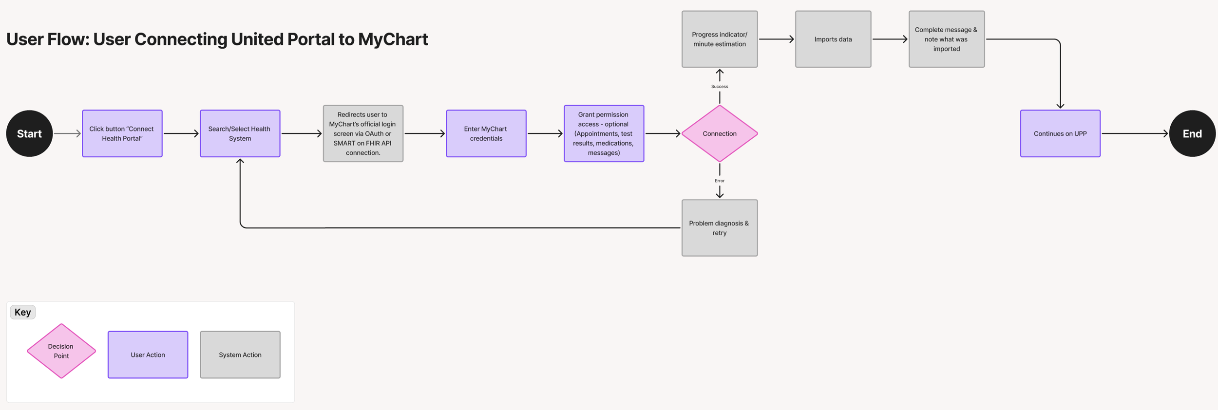
Now that I had my solution and worked through the journey maps, I wanted to define a couple of the basic main flows users would be taking before I started wireframing.
The first user flow examines the process of integrating a medical patient portal with my product:
The second user flow examines the process of creating a health summary packet users can share:
DESIGN SYSTEM
Starting my migration into the design phase, I began by putting together a mood board and some branding concepts.
Visually, I was interested in something clean and simple, but also wanted to thoughtfully utilize color for things like color coding. I knew I’d have elements of calendars and data tables, so I took some time to look into different design styles for those.
For my brand, I wanted to portray a trustworthy platform where someone could go to get accurate information. I also ended up creating a new word for my site’s name: Elaris (eh-lar-us).
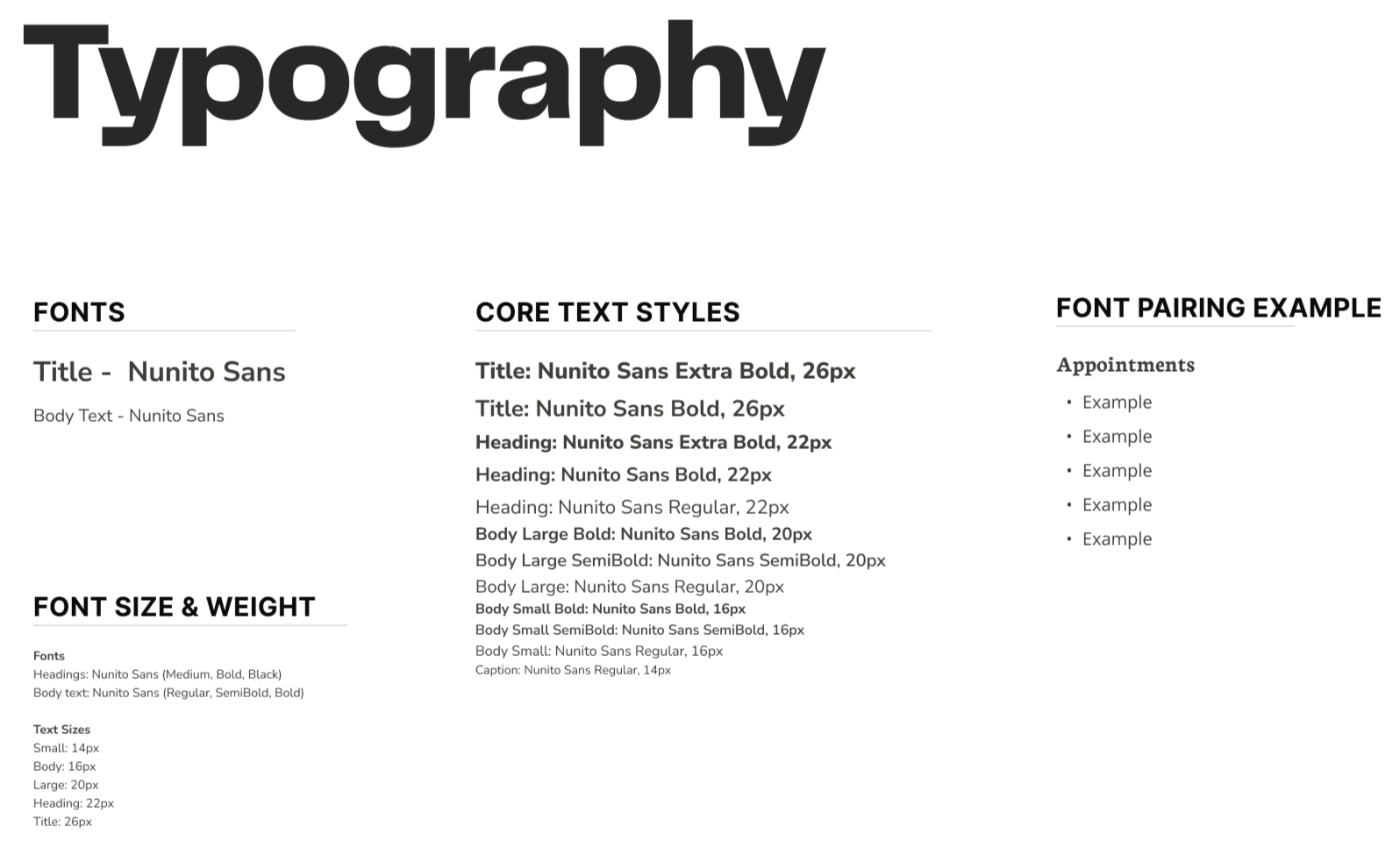
From here, I began to work on my basic design system. Identifying the colors, typography, and iconography I wanted to utilize in my product.
WIREFRAMES
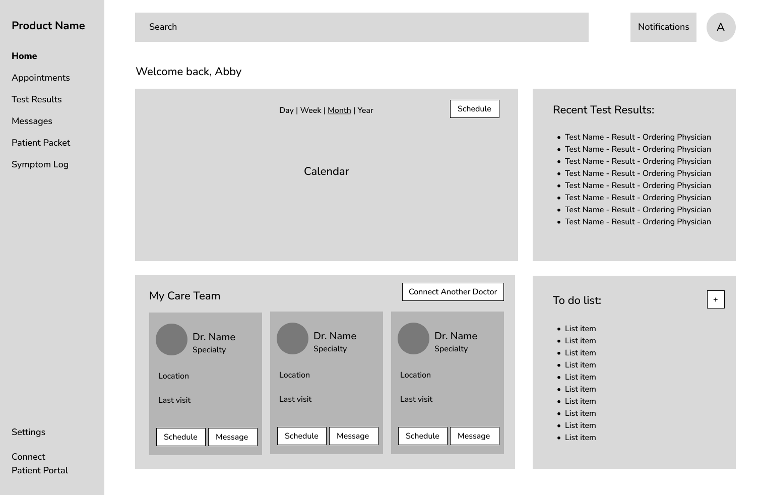
For quick concept and ideation, I started making low-fidelity wireframes of my idea. I also made it into a clickable prototype.
PROTOTYPE (VERSION 1 OF 2)
I then transformed my low-fidelity designs into a higher fidelity prototype which I then did usability tests on.
USABILITY TESTING - METHOD
Purpose: To understand how well users can navigate the prototype and complete the process of adding a patient portal, creating a health summary packet, and proxy access.
Method:
45-minute moderated test over Zoom
Script (view here)
System Usability Scale (SUS) & Task Success Rate
Tested prototype in Figma
Participants:
5 users of varying experience levels
Participant 1 - Recently was in an accident and had to manage multiple doctors and portals.
Participant 2 - No experience managing multiple doctors and portals.
Participant 3 - Chronic illness patient with lots of experience in medical portals.
Participant 4 - Parent of a child with chronic illness, managing multiple doctors and portals.
Participant 5 - Chronic illness patient with multiple conditions and deals with many portals and doctors.
USABILITY TESTING - RESULTS
In the usability tests, I had users complete six tasks within two flows in my prototype:
Flow 1 - Chronic Illness Patient:
Add another medical patient portal
Create a new health summary packet
Flow 2 - Parent:
Switch to their child’s account
View notifications
Change notification views
Change calendar views
Across the five participants, task completion was very strong. All users successfully completed the tasks. The task with the most friction was creating a health packet with a 70% partial success rate. Three users initially missed the dropdown arrows in a table, but ultimately continued on with no issues. Overall, the success rate was 95%, showing an intuitive experience.
I also looked at my product’s System Usability Scale (SUS).
The average score across participants was 94%, which is considered excellent usability. Most participants rated the experience as seamless and intuitive, with participant two scoring slightly lower due to unfamiliarity with medical portals in general.
-
Home Dashboard
Users appreciated clear organization, color-coded appointments, and indicators of test result status (normal/abnormal).
The to-do list was seen as helpful, especially for people who already keep separate health task lists.
Care team visibility (all providers in one place) was valued.
Portal LinkingUniversally praised for clarity and ease of use.
Step-by-step flow (search → login → confirm → sync) felt guided and humanized.
Visual feedback (loading states, sync success indicators) reinforced confidence.
Health PacketConsidered a valuable feature for advocacy and doctor visits.
Participants liked customization, clear progress steps, and the ability to preview, download, and save.
Strong sense of empowerment: “I feel in control of my health.”
Proxy AccessMost expected to switch accounts via the profile dropdown, which matched the design.
Parents liked the color coding and family view options across notifications and calendar.
Notifications & CalendarColor-coding and profile icons worked well for distinguishing family members.
Participants valued the ability to toggle between personal/family views.
Consistency across notifications and calendar views reinforced learnability.
-
Terminology Confusion
With no explanation, 3 users weren’t fully confident what a “Health Packet” was.
“Health Packet” was since it is a new concept. They felt it made sense once they learned.
2 participants were unsure what “Proxy” meant.
The term wasn’t used in the platform, but I wanted to know if users were aware of the meaning. Two users didn’t know, and 3 did. It seemed to correlate with past experience in using proxy access in other sites.
InteractionsDropdown arrows for test result history were missed by 2 participants.
Some users wondered if clicking the row’s main checkbox would select all historical results.
One user didn’t notice text that stated they would be temporarily redirected to a different portal login.
The biggest strengths of the prototype were the clarity of the dashboard, the ease of use, and the sense of empowerment participants felt when creating a health packet. People also really enjoyed the use of color and notification/calendar views for users with proxy access.
There were also a few pain points identified:
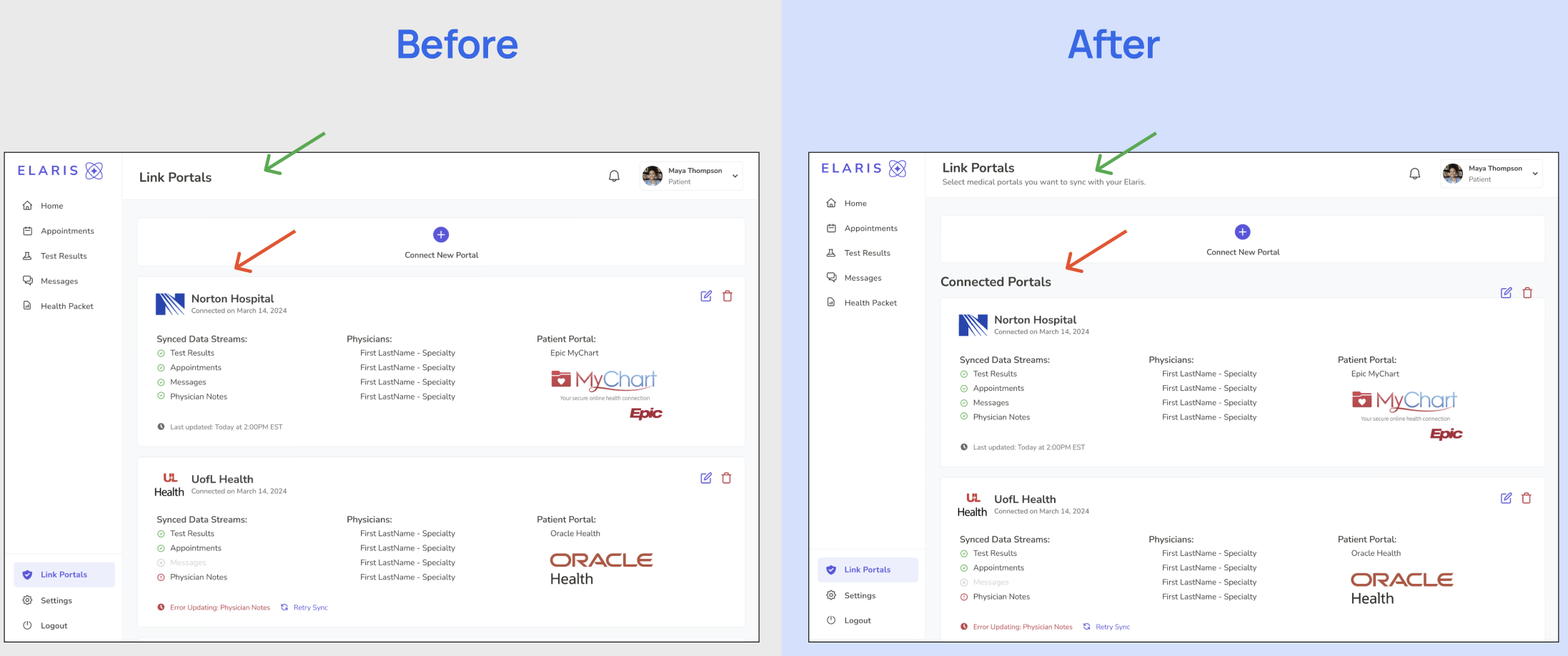
Problem: Participants 1 and 2 had slight hesitation when connecting a new patient portal, that the list they were looking at was portals already connected.
Solution: I added a clear title to show the portals shown being shown are connected and some subtext for the page for further clarity.
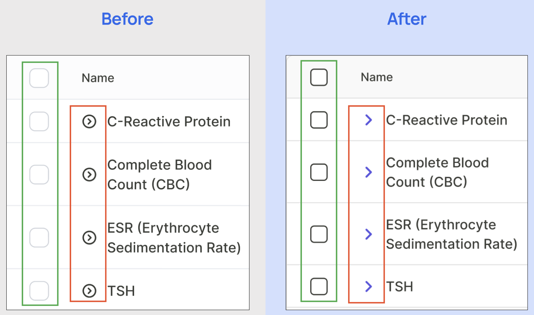
Problem: Participants 1, 2, and 4 did not notice the dropdown arrows in the health summary packet creation within the test result table.
Solution: I changed the icon and color for clarity. I also added some subtext to this section noting the dropdown shows historical data that can be selected.
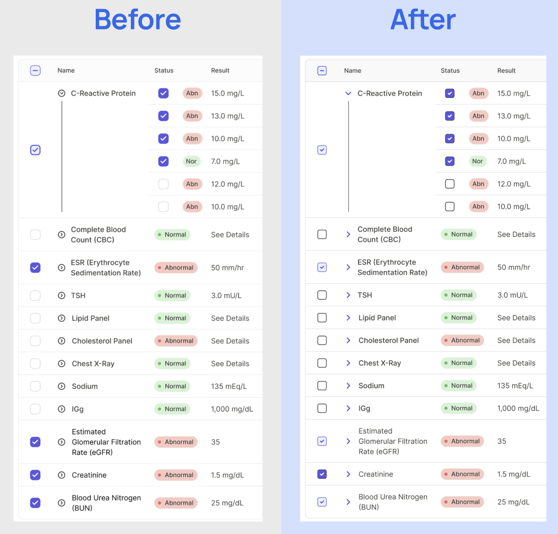
Problem: I noticed the checkbox colors needed updating for clarity.
Solution: A fully dark color represents the selection of a complete selection, the full history. A light color checkbox is representative of a partial selection, like the most recent result (which is the default when closed) or partial history.
Note: I also considered only showing the test name at the highest level. Leaving users to click into the dropdown to select which test results they want. While I think it could help with clarity, generally, people will just be looking for their latest result. And I think this would save some frustration for users who need to make many selections. Though this is an area I am interested in exploring more through additional usability tests.
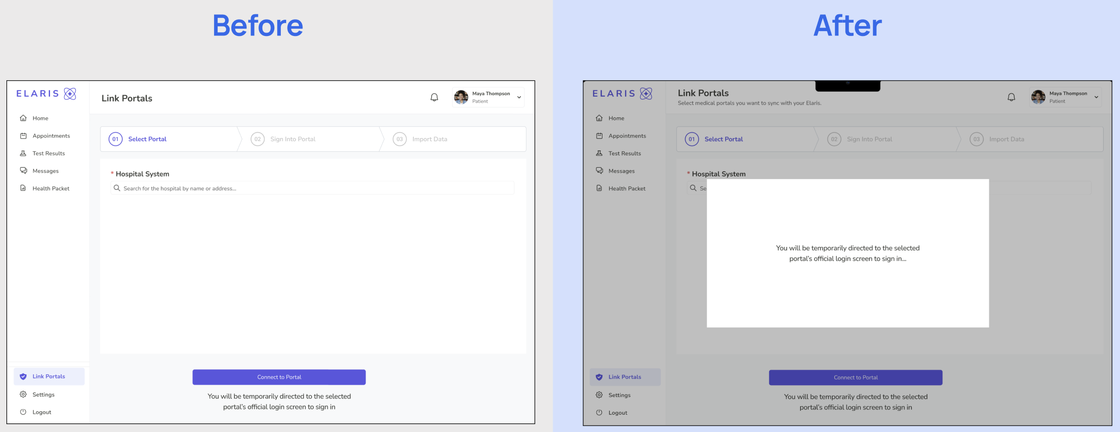
Problem: Participant 2 did not notice the text, noting they would be redirected to the portal login.
Solution: In addition to the text, I included a temporary pop-up that says the user is being redirected to the login portal of the selected system.
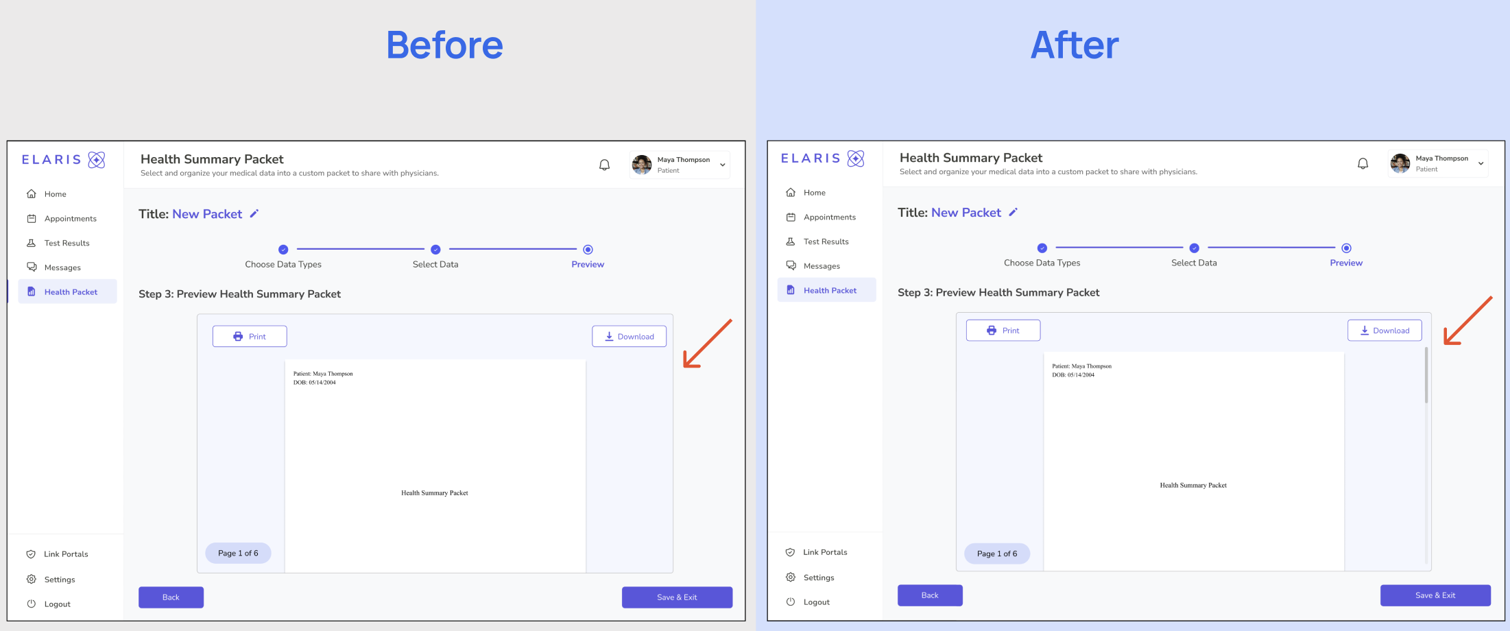
Problem: Participant 1 felt the packet preview was not obviously scrollable.
Solution: I added a scroll bar to help communicate that this preview is scrollable.
Additionally, while it wasn't immediately relevant to the tasks I was exploring in this class, I noticed some terminology hesitation. With new users, they had a harder time with terminology like ‘health packet’ and ‘proxy access’. It just reminded me how useful it could be on a product landing page site to express features, add introductory walkthroughs for new users, and provide helpful descriptors on different elements.
FINAL PROTOTYPE
Now lets dive into the final prototype where I implemented improvements from the findings of the usability tests. Watch a walkthrough or navigate yourself below!
NEXT STEPS
1. Onboarding Walkthrough
Design an interactive onboarding flow to introduce new users to key actions such as connecting their patient portals and creating a Health Summary Packet. This will ensure users immediately understand the product’s value and core features.
2. Expanded Prototyping
Continue prototyping deeper functionality: including patient profiles, appointment details, physician details, and other secondary pages. These expansions will help round out the ecosystem and show how the platform scales beyond the dashboard and packet creation.
3. Usability Testing
Conduct additional rounds of usability testing to validate recent design improvements. In particular, test the test results selection table within the Health Summary Packet flow to see how users interpret and utilize it. Broader usability testing will also help refine overall navigation, terminology, and interaction design.
4. Future User Group Expansion
Explore extending functionality for physicians, allowing them to connect to the unified portal. This would create a shared patient–provider view, reducing duplication, strengthening collaboration, and bringing the platform closer to closing the loop in fragmented care.
REFLECTIONS
Working on this project reminded me just how valuable thorough planning and research really are. By taking the time to do proper desk research, competitive analysis, and multiple rounds of interviews, I was able to gain a much deeper understanding of the problem space and the perspectives of different stakeholders. This level of insight made me feel far more confident in my design decisions because I wasn’t designing in a vacuum; I was grounding every choice in evidence and real-world experiences.
The user interviews, in particular, were incredibly impactful. They helped refine the direction of the project, confirming some of my hypotheses while challenging others. Listening to patients, caregivers, and physicians revealed what people truly needed, where they felt the most friction, and what they actually valued. It was a strong reminder that design is about solving for real needs, not assumptions.
Another key takeaway was the importance of flexibility. Early on, I considered incorporating AI-generated summaries as a core feature. But through my interviews, it became clear that this wasn’t what patients or physicians wanted—or needed. Both groups valued having access to accurate, centralized information more than AI-driven interpretation. In fact, introducing AI risked adding errors or confusion in a highly sensitive context. This experience reinforced the need to remain open to changing direction and stripping away features that don’t directly serve users’ goals.
Overall, this project has been a powerful reminder that empathy, evidence, and iteration are at the heart of good design.
